- switch from some weird status badge to label
- translate untranslated `Reset registration token` string
- change documentation link from act_runner README to Gitea Docs site
- fix "No runners available" message width
- use `ctx.Locale.Tr` where possible

Before:

* The layout is quite complex
* The UI flickers when switch the stats (https://try.gitea.io/)

After:

* Simplify the code
* The UI doesn't flicker
Align everything with a new layout.

* Use "baseline" for some special elements, the "flex-item-icon" is for
the issue list only at the moment and I think it should be general
enough now (but not using "flex-item-leading" anymore in this case).
* Make the labels stretch themselves.
1. There is already `gt-ac`, so no need to introduce `flex-item-center`
2. The `flex-item-baseline` and `.flex-item-icon svg { margin-top: 1px
}` seem to be a tricky patch, they don't resolve the root problem, and
still cause misalignment in some cases.
* The root problem is: the "icon" needs to align with the sibling
"title"
* So, make the "icon" and the "title" both have the same height
3. `flex-text-inline` could only be used if the element is really
"inline", otherwise its `vertical-align` would make the box size change.
In most cases, `flex-text-block` is good enough.

---------
Co-authored-by: silverwind <me@silverwind.io>
Co-authored-by: Giteabot <teabot@gitea.io>
1. In many cases, the `flex-list` has previous and next `gt-hidden`
siblings, so relax the CSS selector to remove all ".segument .flex-list"
paddings.
2. Make the "Add key" button can toggle
3. Move help message into the related segment(panel). Otherwise users
would misread the message, eg: the SSH help seemed for GPG because they
are so near
4. Move modal element into the segment element, otherwise it affects the
layout
The changes for "commit-body" in #26877 are not ideal.

The reason is: the "commit-body" is usually a `<pre>`, it has default
margins. In most cases, we do not need that large margin. So, this PR
introduces a general but small margin for all "commit-body" elements.
Then these `gt-m-0` could be removed.

The `:not` selector is not needed, because the `.timeline-item` selector
is already clear enough.
1. Use `gt-invisible` instead of `invisible`.
2. Use `gt-word-break` instead of `dont-break-out` (there is a slight
different "hyphens", but I think it won't affect too much since it is
only used for the "full name").
3. Remove `.small.button:has(svg)` , now our buttons could layout SVG
correctly, and actually I didn't see this CSS class is used in code.
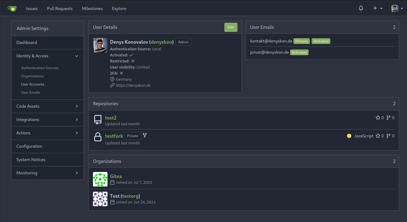
This PR implements a proposal to clean up the admin users table by
moving some information out to a separate user details page (which also
displays some additional information).
Other changes:
- move edit user page from `/admin/users/{id}` to
`/admin/users/{id}/edit` -> `/admin/users/{id}` now shows the user
details page
- show if user is instance administrator as a label instead of a
separate column
- separate explore users template into a page- and a shared one, to make
it possible to use it on the user details page
- fix issue where there was no margin between alert message and
following content on admin pages
<details>
<summary>Screenshots</summary>


</details>
Partially resolves #25939
---------
Co-authored-by: Giteabot <teabot@gitea.io>
Backtick syntax now works in repo description too. Also, I replaced the
CSS for this was a new single class, making it more flexible and not
dependent on a parent. Also, very slightly reduced font size from 16.8px
to 16px.

---------

Co-authored-by: wxiaoguang <wxiaoguang@gmail.com>
Each change is tested manually line by line. There are too many changes
so I can't share dozens of screenshots.

In short:

1. `ui right` could be still used in `ui top attached header`, because
there is a special case.
2. A lot of `ui right` are just no-op, so they can be removed safely.
3. Some of the `ui right` should be replaced by `gt-float-right` (to
avoid breaking, leave them to the future).
4. A few of the `ui right` could be rewritten by flex.
Corollary to #26775:
All selectors I found that are actually used and not necessarily present
in the current code have been copied to `web_src/css/base.css`.
Everything else should be a clean removal.
Replace #26761
It's better to keep children elements simple, and let parent containers
layout the necessary padding/margin.
The old `not(:last-child)` and `.flex-item + .flex-item` are not easy to
maintain (for example, what if the developer would like to use a "tiny
height" item?)
The old approach also makes some UI look strange because the first item
doesn't have proper padding-top.
In this PR, we just simply use `.flex-item { padding: ... }`:
* Developers could manually set the item height they want easily
* It's easier to make it work with various containers -- with padding
(`ui segment`) and without padding (`div`)
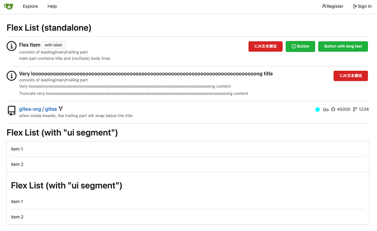
And added more samples/examples.

Co-authored-by: Giteabot <teabot@gitea.io>
1. Fine tune the CSS styles, and add more examples
2. Add necessary "dimmer" animation for modal dialogs, otherwise the UI
seems flicking (follow #26469)
## Changes
- no more hardcoded `border-radius`es (apart from `0`)
- no more value inconsistencies
- no more guessing what pixel value you should use
- two new variables:
- `--border-radius-medium` (for elements where the normal border radius
does not suffice)
  - `--border-radius-circle` (for displaying circles)

---------

Co-authored-by: silverwind <me@silverwind.io>
The "btn-octicon is-loading" was introduced by #21842 , it is only used
by the "Copy Content" button, but the "btn-octicon" selector would
affect too many uncertain elements.

Now there is a general "small-loading-icon" class, so the "btn-octicon
is-loading" could be removed.
1. Use `is-loading` instead of `ui loader`
2. Introduce class name `image-diff-tabs`, instead of searching `gt-hidden`, which is fragile
3. Align the UI elements, see the screenshots.
Fix #26617

1. Separate the "flex-list" examples into a dedicated template, and add some more examples
2. Use `flex-basis` instead of `flex-shrink` for `flex-item-trailing`, to avoid wrapping the texts too aggressively
3. Some `flex-wrap: wrap;` are removed