Giteabot
3bab20491e
Fix being unable to use a repo that prohibits accepting PRs as a PR source. ( #26785 ) ( #26790 )
...
Backport #26785 by @CaiCandong
## Description
Sometimes, we need to use an upstream mirror repository to update the
current development repository, but mirror repositories are prohibited
from PR. It should not appear in `merge to,` but it can appear in `pull
from.`
Fix #24585 #26193 #26781
Related #24183
Many thanks to @apnote for assisting me in reproducing this bug!
## ScreenShot
---
### Before
<img
src="https://github.com/go-gitea/gitea/assets/50507092/3d76c376-1f54-45b9-80c9-6ba8319d6a9a "
width="400px">
<img
src="https://github.com/go-gitea/gitea/assets/50507092/fbfd9f7f-421f-4a2e-9a3e-f2958bbf3312 "
width="400px">
### After
<img
src="https://github.com/go-gitea/gitea/assets/50507092/e6984524-4f61-4310-b795-4d8598bd8963 "
width="400px">
<img
src="https://github.com/go-gitea/gitea/assets/50507092/04065b44-78d7-4721-bf31-0f1674150727 "
width="400px">
Co-authored-by: CaiCandong <50507092+CaiCandong@users.noreply.github.com>
2023-08-29 18:06:05 +08:00
Lunny Xiao
b159ebbab7
Use docs.gitea.com instead of docs.gitea.io ( #26769 )
...
backport #26739
2023-08-28 19:58:16 +08:00
wxiaoguang
307ee2c044
Fix incorrect "tabindex" attributes ( #26733 ) ( #26734 )
...
Backport #26733 manually

Co-authored-by: Giteabot <teabot@gitea.io>
2023-08-26 10:44:17 +08:00
Giteabot
2f6c0e6596
Fix link in mirror docs ( #26719 ) ( #26732 )
...
Backport #26719 by @silverwind

Fix hash fragment in this link

Co-authored-by: silverwind <me@silverwind.io>
2023-08-25 19:14:43 +02:00
Giteabot
4af872178e
Make issue template field template access correct template data ( #26698 ) ( #26709 )
...
Backport #26698 by @wxiaoguang
Regression of #23092 , the `{{$field := .}}` was missing during that
refactoring.
Co-authored-by: wxiaoguang <wxiaoguang@gmail.com>
2023-08-24 11:40:55 +00:00
Giteabot
acc0fd22d8
Add ThreadID parameter for Telegram webhooks ( #25996 ) ( #26480 )
...
Backport #25996

Telegram has recently implemented threads (channels) for group chats.

Co-authored-by: Earl Warren <109468362+earl-warren@users.noreply.github.com>
Co-authored-by: neveraskedtoexist <matikot415@gmail.com>
2023-08-14 08:55:17 +08:00
Giteabot
2bdc38e592
Fix incorrect color of selected assignees when create issue ( #26324 ) ( #26372 )
...
Backport #26324 by @yp05327
Before:

After:

Co-authored-by: yp05327 <576951401@qq.com>
2023-08-11 12:38:39 +02:00
delvh
39cbca0f95
Display human-readable text instead of cryptic filemodes ( #26352 ) ( #26358 )
...
Backport #26352
Now, you don't need to be a git expert anymore to know what these numbers mean.
## Before

## After

or when the mode actually changed:

2023-08-06 23:15:01 +02:00
Giteabot
59354d7135
Hide last indexed SHA when a repo could not be indexed yet ( #26340 ) ( #26345 )
...
Backport #26340 by @CaiCandong
Now, for a new repo without any commit, the Last indexed SHA field looks
like this:
Before:

After:

fix #26336
Co-authored-by: CaiCandong <50507092+CaiCandong@users.noreply.github.com>
2023-08-05 16:08:17 +00:00
Giteabot
2cf1515f5c
Fix due date rendering the wrong date in issue ( #26268 ) ( #26274 )
...
Backport #26268 by @yardenshoham
Closes #26263
We have to pass the date without the time.
# Before

# After

Signed-off-by: Yarden Shoham <git@yardenshoham.com>
Co-authored-by: Yarden Shoham <git@yardenshoham.com>
2023-08-01 16:40:35 +00:00
Giteabot
2517da90aa
Use shared template for webhook icons ( #26242 ) ( #26246 )
...
Backport #26242 by @silverwind

Fixes: https://github.com/go-gitea/gitea/issues/26241

Co-authored-by: silverwind <me@silverwind.io>
2023-07-31 10:09:13 +00:00
Giteabot
0f265a2489
Don't autosize textarea in diff view ( #26233 ) ( #26244 )
...
Backport #26233 by @silverwind

Resizing the comment editor can be a very expensive operation because it
triggers page reflows, which on large PRs can take upwards of seconds to
complete. Disable this mechanism on the diff page only where we know
that the page can get large.

Fixes https://github.com/go-gitea/gitea/issues/26201 for the textarea
editor.

I don't think this can be fixed for EasyMDE because as far as I can
tell, it exposes no option to disable this resizing.

Co-authored-by: silverwind <me@silverwind.io>
2023-07-31 10:02:25 +02:00
Giteabot
2122743093
Fixed incorrect locale references ( #26218 ) ( #26222 )
...
Backport #26218 by @kerwin612

Fixed two incorrect headers for setting the page navigation bar:
* User settings page, should not use the title "`org.settings`"
* Repo settings page, should not use the title "`org.settings`"

Co-authored-by: Kerwin Bryant <kerwin612@qq.com>
2023-07-29 21:54:35 +00:00
Giteabot
81d3dc1da5
Fix commit compare style ( #26209 ) ( #26226 )
...
Backport #26209 by @puni9869
as title
Fixes : #25825
Before
<img width="1334" alt="image"
src="https://github.com/go-gitea/gitea/assets/80308335/c54a41b0-39bd-4094-a956-081a8f4128f2 ">
After change
<img width="1340" alt="image"
src="https://github.com/go-gitea/gitea/assets/80308335/c112d235-6bbe-4bcb-9529-78da3ab0fa14 ">
Co-authored-by: puni9869 <80308335+puni9869@users.noreply.github.com>
2023-07-29 16:54:51 +00:00
Giteabot
0f73be0ae3
Fix LFS object list style ( #26133 ) ( #26147 )
...
Backport #26133 by @wxiaoguang
Close #26104 . Only a quick fix, the UI is not perfect.
Before:
<details>


</details>
After:
<details>


</details>
Co-authored-by: wxiaoguang <wxiaoguang@gmail.com>
2023-07-26 12:58:48 +08:00
Giteabot
3b518a3af5
Improve commit graph alignment and truncating ( #26112 ) ( #26127 )
...
Backport #26112 by @wxiaoguang
Fix #26101

Co-authored-by: wxiaoguang <wxiaoguang@gmail.com>
2023-07-25 11:43:39 +00:00
Giteabot
ab4fd9aa1f
Fix duplicated url prefix on issue context menu ( #26066 ) ( #26067 )
...
Backport #26066 by @lunny

Fix #26060

Co-authored-by: Lunny Xiao <xiaolunwen@gmail.com>
2023-07-23 10:27:34 +00:00
Giteabot
864bdd0ac8
Make pending commit status yellow again ( #25935 ) ( #25968 )
...
Backport #25935 by @silverwind
With the introduction of Actions, the pending commit icon has changed
from yellow to grey for Drone integrations which never set the "running"
status, so it stays in "pending" until completion.
I find it better to have this icon colored like on 1.19. Now both the
"pending" and "running" icons look the same, but I guess we could add an
animation to the "running" state similar to GitHub has to it later.
Before:
<img width="339" alt="Screenshot 2023-07-17 at 19 14 19"
src="https://github.com/go-gitea/gitea/assets/115237/2f4886e4-74fd-42ea-b59e-9af8f141bf1f ">
After:
<img width="335" alt="Screenshot 2023-07-17 at 19 14 30"
src="https://github.com/go-gitea/gitea/assets/115237/53189642-e72d-47f6-9cbe-f14eda28f730 ">
Also, it matches GH's icon:
<img width="466" alt="image"
src="https://github.com/go-gitea/gitea/assets/115237/5804ff90-d223-4a3c-8093-7a9abbaacf87 ">
Co-authored-by: silverwind <me@silverwind.io>
Co-authored-by: delvh <dev.lh@web.de>
2023-07-19 06:43:41 +00:00
Giteabot
186f07bbf7
Make add line comment buttons focusable ( #25894 ) ( #25896 )
...
Backport #25894 by @sebastian-sauer

Use a real button and add an aria-label.
Additionally, show the button whenever it is focused.
See https://codeberg.org/forgejo/forgejo/issues/998 for explanation.

Our handling of this button is now equal to that of GitHub.
Nothing has changed visually.

Co-authored-by: sebastian-sauer <sauer.sebastian@gmail.com>
2023-07-15 12:18:49 +02:00
Giteabot
026e745b9e
Fix incorrect release count ( #25879 ) ( #25887 )
...
Backport #25879 by @yp05327
Release count is not correct:
https://try.gitea.io/yp05327/testrepo/tags

https://try.gitea.io/yp05327/testrepo/releases

https://try.gitea.io/yp05327/testrepo/releases/tag/testtag

We already have correct release count, no need to calculate it again.
c5e187c389/modules/context/repo.go (L547)
2023-07-14 09:32:43 +00:00
wxiaoguang
012b804a9a
Clarify "text-align" CSS helpers, fix clone button padding ( #25763 ) ( #25764 )
...
Backport  #25763

Co-authored-by: silverwind <me@silverwind.io>
Co-authored-by: Giteabot <teabot@gitea.io>
2023-07-10 00:19:24 +02:00
Giteabot
32eaba1b40
Hide add file button for pull mirrors ( #25748 ) ( #25751 )
...
Backport #25748 by @hiifong
I think hiding the add file button for mirror repositories that can keep
the ui clean.
Before:

After:
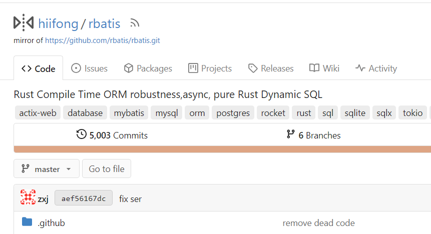
Co-authored-by: hiifong <i@hiif.ong>
2023-07-07 14:12:59 +00:00
Denys Konovalov
917ca5ded9
Several fixes for mobile UI ( #25634 ) ( #25689 )
...
Backport #25634
Resolves https://github.com/go-gitea/gitea/issues/25622
<details>
<summary>Screenshots</summary>


</details>
---------
Co-authored-by: wxiaoguang <wxiaoguang@gmail.com>
Co-authored-by: silverwind <me@silverwind.io>
Co-authored-by: Giteabot <teabot@gitea.io>
2023-07-07 00:34:00 +02:00
Giteabot
e595dfeec7
Allow/fix review (approve/reject) of empty PRs ( #25690 ) ( #25732 )
...
Backport #25690 by @sebastian-sauer
gitea allows to create empty PRs.
Currently when you need approvals for a merge, you have to manually add
/files to the url to get to the files tab to approve / reject the PR.
This PR allows to open the files tab via the normal tab / link and then
fixes the layout of the files tab.
**Screenshots:**
Before:

After:

Co-authored-by: sebastian-sauer <sauer.sebastian@gmail.com>
Co-authored-by: silverwind <me@silverwind.io>
2023-07-06 19:34:41 +00:00
Giteabot
68e0c802f7
Show correct naming for 1 comment ( #25704 ) ( #25712 )
...
Backport #25704 by @earl-warren

- Resolves https://codeberg.org/forgejo/forgejo/issues/948

Co-authored-by: Earl Warren <109468362+earl-warren@users.noreply.github.com>
Co-authored-by: Gusted <postmaster@gusted.xyz>
2023-07-06 16:04:13 +00:00
Giteabot
04eea29ecb
Fix tags header and pretty format numbers ( #25624 ) ( #25694 )
...
Backport #25624 by @lunny
This casused by #23465
Before
release disabled
<img width="1320" alt="图片"
src="https://github.com/go-gitea/gitea/assets/81045/190a1c81-daa5-41bc-91ac-c9a0bf629b5f ">
release enabled
<img width="1320" alt="图片"
src="https://github.com/go-gitea/gitea/assets/81045/a0372c31-727c-4ee0-a6b9-30e502498d90 ">
After
release disabled
<img width="1304" alt="图片"
src="https://github.com/go-gitea/gitea/assets/81045/a747ea80-a3d9-4792-8f6d-e8955da78b9e ">
release enabled
<img width="1290" alt="图片"
src="https://github.com/go-gitea/gitea/assets/81045/7c0bc43a-9149-4148-859d-35839aeb60ca ">
Co-authored-by: Lunny Xiao <xiaolunwen@gmail.com>
2023-07-05 07:08:16 +00:00
silverwind
491f36d32a
Actions list enhancements ( #25601 ) ( #25678 )
...
Backport https://github.com/go-gitea/gitea/pull/25601 to 1.20.
Various small enhancements to the actions list. Before and after:
<img width="1264" alt="Screenshot 2023-06-30 at 00 11 40"
src="https://github.com/go-gitea/gitea/assets/115237/bb4162ee-cdcf-4a73-b05e-f9521562edbb ">
<img width="1264" alt="Screenshot 2023-06-30 at 00 09 51"
src="https://github.com/go-gitea/gitea/assets/115237/52a70ea9-4bb3-406e-904b-0fdaafde9582 ">
Co-authored-by: Giteabot <teabot@gitea.io>
2023-07-04 13:00:34 +00:00
Giteabot
1ddfe03131
Use AfterCommitId to get commit for Viewed functionality ( #25529 ) ( #25612 )
...
Backport #25529 by @sebastian-sauer

the PullHeadCommitID is not always available when the PR is merged.

Not sure if this is the best solution but in my simple tests it looks
like this fixes the problem - happy to get any feedback.

hopefully fixes https://github.com/go-gitea/gitea/issues/24813

Co-authored-by: sebastian-sauer <sauer.sebastian@gmail.com>
2023-07-01 07:56:56 +08:00
Giteabot
0b6f7fb607
read-only checkboxes don't appear and don't entirely act the way one might expect ( #25573 ) ( #25602 )
...
Backport #25573 by @saegl5
This pull request fades read-only checkboxes and checkmark, and it makes
the checkboxes act more read-only/disabled by not changing the
border-color when clicked.
Examples using light mode:
| Before | After |
| - | - |
| 
| 
|
| 
| 
|
| | read-only checkboxes and checkmark are faded<br>and the checkboxes
act more read-only/disabled |
Fixes/Closes/Resolves #25076
Co-authored-by: Ed Silkworth <ed.silkworth@icloud.com>
Co-authored-by: silverwind <me@silverwind.io>
Co-authored-by: wxiaoguang <wxiaoguang@gmail.com>
2023-06-29 22:53:43 +00:00
Giteabot
51b6a78791
Fix milestones deletion ( #25583 ) ( #25584 )
...
Backport #25583 by @HesterG

Close #25557
Fix regression from #25315

`data-id` is still needed for deleting milestone.

Co-authored-by: HesterG <hestergong@gmail.com>
2023-06-29 08:52:05 +00:00
Giteabot
9bbb4d8d6d
Improve loadprojects for issue list ( #25468 ) ( #25493 )
2023-06-26 02:06:58 +00:00
Giteabot
85bad22ff8
Fine tune "dropdown button" icon ( #25442 ) ( #25499 )
...
Backport #25442 by @wxiaoguang

----

Co-authored-by: wxiaoguang <wxiaoguang@gmail.com>
2023-06-25 14:35:26 +08:00
Giteabot
51789ba12d
Improve wiki sidebar and TOC ( #25460 ) ( #25477 )
...
Backport #25460 by @wxiaoguang
Close #20976
Close #20975
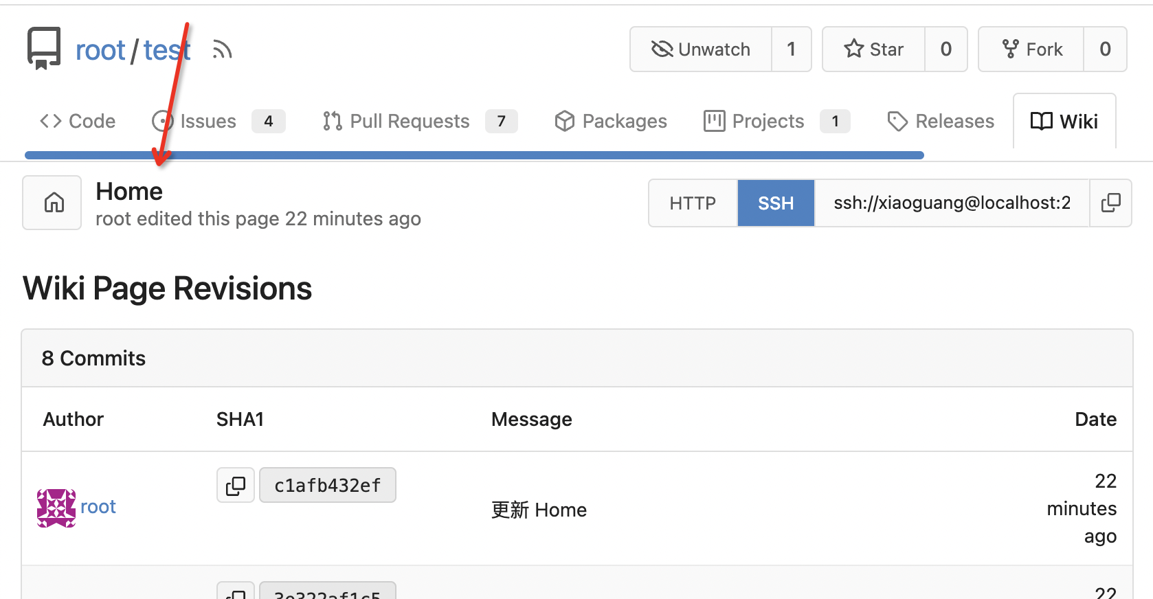
1. Fix the bug: the TOC in footer was incorrectly rendered as main
content's TOC
2. Fix the layout: on mobile, the TOC is put above the main content,
while the sidebar is put below the main content
3. Auto collapse the TOC on mobile
ps: many styles of "wiki.css" are moved from old css files, so leave
nits to following PRs.
### for desktop

### for mobile

### other changed pages
<details>

</details>
Co-authored-by: wxiaoguang <wxiaoguang@gmail.com>
2023-06-24 10:16:15 +08:00
Giteabot
2e64449de7
Make "dismiss" content shown correctly ( #25461 ) ( #25465 )
...
Backport #25461 by @wxiaoguang
Close #25127

Co-authored-by: wxiaoguang <wxiaoguang@gmail.com>
2023-06-23 11:04:15 +00:00
Giteabot
056829749e
Diff page enhancements ( #25398 ) ( #25437 )
...
Backport #25398 by @silverwind
Two small tweaks:
1. Vertically center arrow here when editing a PR:
<img width="405" alt="Screenshot 2023-06-20 at 19 48 49"
src="https://github.com/go-gitea/gitea/assets/115237/1d63764d-9fd9-467e-8a8e-9258c06475eb ">
2. Use 2-row layout on diff viewed status and show it again on mobile:
<img width="142" alt="Screenshot 2023-06-20 at 19 51 21"
src="https://github.com/go-gitea/gitea/assets/115237/3046e782-163c-4f87-910c-a22066de8f1b ">
Mobile view:
<img width="370" alt="Screenshot 2023-06-20 at 19 44 40"
src="https://github.com/go-gitea/gitea/assets/115237/9cf56347-7323-4d05-99a5-17ad215ee44d ">
Co-authored-by: silverwind <me@silverwind.io>
2023-06-22 14:33:13 +02:00
Giteabot
ea00ed320d
Various UI fixes ( #25264 ) ( #25431 )
...
Backport #25264 by @silverwind
Numerous small UI fixes:
- Fix double border in collaborator list
- Fix system notice table background
- Mute links in repo and org lists
- Downsize projects edit buttons
- Improve milestones and project list rendering
- Condense milestone list entry to a single line of "metas"
- Mute ".." button in repo files list
<img width="899" alt="Screenshot 2023-06-14 at 21 19 23"
src="https://github.com/go-gitea/gitea/assets/115237/40d70006-5f76-49ad-b43c-4343ec3311e1 ">
<img width="905" alt="Screenshot 2023-06-14 at 21 18 29"
src="https://github.com/go-gitea/gitea/assets/115237/46ef39ea-ab26-452d-89b0-a55d0cfacfdb ">
<img width="270" alt="Screenshot 2023-06-14 at 21 14 09"
src="https://github.com/go-gitea/gitea/assets/115237/aa16e833-a03b-4231-bc7c-159a6a6bee19 ">
<img width="409" alt="Screenshot 2023-06-14 at 21 12 13"
src="https://github.com/go-gitea/gitea/assets/115237/b5242d41-f87a-4837-b0cf-9cc4c1f43daf ">
<img width="286" alt="Screenshot 2023-06-14 at 21 10 03"
src="https://github.com/go-gitea/gitea/assets/115237/d0c36e47-651b-4d34-ad95-3d59474a7c3e ">
<img width="928" alt="Screenshot 2023-06-14 at 21 05 24"
src="https://github.com/go-gitea/gitea/assets/115237/fc3b713e-d252-40f5-b6ba-6e5a741ab500 ">
<img width="217" alt="Screenshot 2023-06-14 at 21 02 01"
src="https://github.com/go-gitea/gitea/assets/115237/c4c33376-18d6-4820-aff5-f508f6d351a0 ">
<img width="79" alt="Screenshot 2023-06-14 at 20 42 43"
src="https://github.com/go-gitea/gitea/assets/115237/034b5950-c0bf-473b-a2f7-0c27a0259f29 ">
<img width="607" alt="Screenshot 2023-06-14 at 21 00 42"
src="https://github.com/go-gitea/gitea/assets/115237/fba2d3fd-bd3e-4daf-8b2f-530a1c99c8bc ">
Co-authored-by: silverwind <me@silverwind.io>
2023-06-22 10:19:38 +00:00
sebastian-sauer
30a783879f
Show outdated comments in files changed tab ( #24936 ) ( #25428 )
...
Backport #24936
If enabled show a clickable label in the comment. A click on the label
opens the Conversation tab with the comment focussed - there you're able
to view the old diff (or original diff the comment was created on).
**Screenshots**


When resolved and outdated:

Option to enable/disable this (stored in user settings - default is
disabled):


fixes #24913
Co-authored-by: silverwind <me@silverwind.io>
2023-06-22 08:34:42 +00:00
Giteabot
cda69a0363
Fix dropdown icon layout on diff page ( #25397 ) ( #25403 )
...
Backport #25397 by @wxiaoguang
Address
https://github.com/go-gitea/gitea/pull/25163#issuecomment-1599207916
Remove the unused "icon-button".
And fix the layout:
Without the dropdown icon:
```
{{svg "gitea-whitespace"}}
```

With the dropdown icon:
```
{{svg "gitea-whitespace" 16 "gt-mr-3"}}
{{svg "octicon-triangle-down" 14 "dropdown icon"}}
```

Co-authored-by: wxiaoguang <wxiaoguang@gmail.com>
2023-06-21 10:55:11 +08:00
Giteabot
e9105ac281
Fix label list divider ( #25312 ) ( #25372 )
...
Backport #25312 by @wxiaoguang
We only needs 2 lines to hide the dividers.
```
$dropdownLabelFilter.dropdown('setting', {'hideDividers': 'empty'});
$dropdownLabelFilter.dropdown('refreshItems');
```
Other code blocks are refactored by the way.


Co-authored-by: wxiaoguang <wxiaoguang@gmail.com>
2023-06-19 18:14:31 +00:00
Giteabot
e6e1cfd8e4
fix issue filters on mobile view ( #25368 ) ( #25371 )
...
Backport #25368 by @denyskon
Fix #24846 applying the solution proposed by @silverwind
<details>
<summary>Screenshots</summary>


</details>
Replaces #25335
Co-authored-by: Denys Konovalov <kontakt@denyskon.de>
2023-06-19 17:43:22 +00:00
Giteabot
b673edbeaf
Fix UI on mobile view ( #25315 ) ( #25340 )
...
Backport #25315 by @denyskon
Various fixes to pages or elements which were looking ugly on mobile.
<details>
<summary>Screenshots</summary>


</details>
Co-authored by: @silverwind
Co-authored-by: Denys Konovalov <kontakt@denyskon.de>
Co-authored-by: silverwind <me@silverwind.io>
2023-06-18 13:02:41 +00:00
Giteabot
4e79c76ed0
When viewing a file, hide the add button ( #25320 ) ( #25339 )
...
Backport #25320 by @hiifong
Fix #25281
When viewing a file, hide the add button

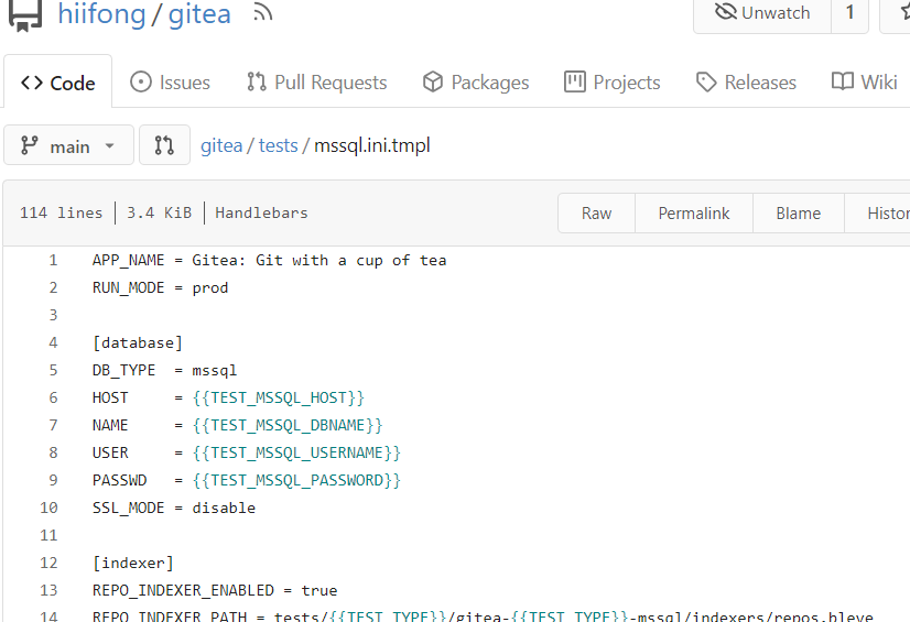
Co-authored-by: hiifong <i@hiif.ong>
2023-06-18 10:24:54 +00:00
Giteabot
e5422db5c7
Show if File is Executable ( #25287 ) ( #25300 )
...
Backport #25287 by @JakobDev
This simply shows if a File has the executable Permission

Co-authored-by: JakobDev <jakobdev@gmx.de>
Co-authored-by: silverwind <me@silverwind.io>
2023-06-16 09:29:26 +00:00
Giteabot
783f7ccb2c
Fix some UI alignments ( #25277 ) ( #25290 )
...
Backport #25277 by @wxiaoguang
Fixes: https://github.com/go-gitea/gitea/issues/25282
Fix the problems:
1. The `repo-button-row` had various patches before, this PR makes it
consistent
2. The "Add File" has wrong CSS class "icon", remove it
3. The "Add File" padding was overridden by "!important", fix it by
`.repo-button-row .button.dropdown` with comment
4. The selector `.ui.segments ~ .ui.top.attached.header` is incorrect,
it should use `+`
The `repo-button-row` is only used on 3 pages:


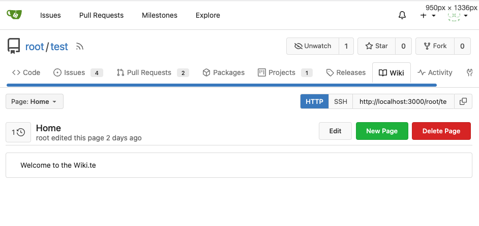

Co-authored-by: wxiaoguang <wxiaoguang@gmail.com>
2023-06-16 00:32:59 +00:00
Giteabot
5191ab6445
Use flex to align SVG and text ( #25163 ) ( #25260 )
...
Backport #25163 by @wxiaoguang
The code can be as simple as:
```html
<div class="flex-text-block">{{svg "octicon-alert"}} {{svg "octicon-x"}} text (block)</div>
<div><div class="flex-text-inline">{{svg "octicon-alert"}} {{svg "octicon-x"}} text</div> (inline)</div>
<div><button class="ui red button">{{svg "octicon-alert" 24}} {{svg "octicon-x" 24}} text</button></div>
```

Co-authored-by: wxiaoguang <wxiaoguang@gmail.com>
2023-06-14 13:21:48 -04:00
silverwind
224ee0d4e5
Fix strange UI behavior of cancelling dismiss review modal ( #25172 )
...
Backport clean cherry-picks of
https://github.com/go-gitea/gitea/pull/25133 and
https://github.com/go-gitea/gitea/pull/25162 to 1.20.
2023-06-11 02:54:30 +00:00
silverwind
ee26d1c578
Button and color enhancements ( #24989 ) ( #25176 )
...
Backport #24989 . Clean cherry-pick aside from one small conflict with
divider.
- Various corrections to button styles, especially secondary
- Remove focus highlight, it's annoying when it stays on button after
press
- Clearly define ghost and link buttons with demos in devtest
- Remove black, grey and tertiary buttons, they should not be used
- Make `arc-green` slightly darker
<img width="1226" alt="image"
src="https://github.com/go-gitea/gitea/assets/115237/8d89786a-01ab-40f8-ae5a-e17f40e35084 ">
<img width="1249" alt="image"
src="https://github.com/go-gitea/gitea/assets/115237/83651e6d-3c27-46ff-b8bd-ff344d70e949 ">
2023-06-11 02:13:08 +00:00
Giteabot
18093d4c9a
Fix mobile navbar and misc cleanups ( #25134 ) ( #25169 )
...
Backport #25134 by @silverwind
- Fix and improve mobile navbar layout
- Apply all cleanups suggested in
https://github.com/go-gitea/gitea/pull/25111
- Make media query breakpoints match Fomantic's exactly
- Clean up whitespace in class on navbar items
Mobile navbar before and after:
<img width="745" alt="Screenshot 2023-06-08 at 08 40 56"
src="https://github.com/go-gitea/gitea/assets/115237/ca84b239-b10f-41db-8c06-dcf2b6dd9d28 ">
<img width="739" alt="Screenshot 2023-06-08 at 08 41 23"
src="https://github.com/go-gitea/gitea/assets/115237/09133c54-eb7e-4110-858c-ead23c3b7521 ">
2023-06-11 09:50:39 +08:00
HesterG
58536093b3
Add details summary for vertical menus in settings to allow toggling ( #25098 )
...
Close #25051
[referenced
answer](https://stackoverflow.com/questions/10813581/can-i-replace-the-expand-icon-of-the-details-element/69722686#69722686 )
for marker overwrite. One limitation is that fomantic does not have
hover and active effects for the vertical submenu
([reference](https://fomantic-ui.com/collections/menu.html#sub-menu )).
And we might need to overwrite some styles if hover and active effects
are needed.
Update:
Used `data:image/svg` instead of `marker` content. And adjusted styles
for hover effect.
Take admin settings as an example:
https://github.com/go-gitea/gitea/assets/17645053/63f69823-ef43-47d5-a518-544b5ea35ba6
---------
Co-authored-by: silverwind <me@silverwind.io>
2023-06-07 10:49:48 +08:00
Yevhen Pavlov
8d7893e817
Don't display select all issues checkbox when no issues are available ( #25086 )
...
Before:
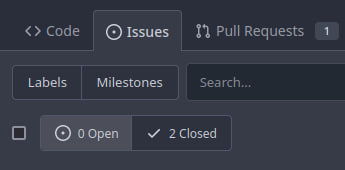
After:

2023-06-06 08:19:24 +08:00