This is an alternative solution to #22824
and would also close #22781

This makes the PR diff view always full width.
It makes sense to make use of that screen real estate. If you want a
more narrow view you can always resize your browser.
It also avoids cluttering the UI with another button + the database with
another column for the setting.

This is also how github and gitlab do it.
Allow back-dating user creation via the `adminCreateUser` API operation.
`CreateUserOption` now has an optional field `created_at`, which can
contain a datetime-formatted string. If this field is present, the
user's `created_unix` database field will be updated to its value.

This is important for Blender's migration of users from Phabricator to
Gitea. There are many users, and the creation timestamp of their account
can give us some indication as to how long someone's been part of the
community.

The back-dating is done in a separate query that just updates the user's
`created_unix` field. This was the easiest and cleanest way I could
find, as in the initial `INSERT` query the field always is set to "now".
To avoid duplicated load of the same data in an HTTP request, we can set
a context cache to do that. i.e. Some pages may load a user from a
database with the same id in different areas on the same page. But the
code is hidden in two different deep logic. How should we share the
user? As a result of this PR, now if both entry functions accept
`context.Context` as the first parameter and we just need to refactor
`GetUserByID` to reuse the user from the context cache. Then it will not
be loaded twice on an HTTP request.

But of course, sometimes we would like to reload an object from the
database, that's why `RemoveContextData` is also exposed.

The core context cache is here. It defines a new context
```go
type cacheContext struct {
	ctx  context.Context
	data map[any]map[any]any
        lock sync.RWMutex
}

var cacheContextKey = struct{}{}

func WithCacheContext(ctx context.Context) context.Context {
	return context.WithValue(ctx, cacheContextKey, &cacheContext{
		ctx:  ctx,
		data: make(map[any]map[any]any),
	})
}
```

Then you can use the below 4 methods to read/write/del the data within
the same context.

```go
func GetContextData(ctx context.Context, tp, key any) any
func SetContextData(ctx context.Context, tp, key, value any)
func RemoveContextData(ctx context.Context, tp, key any)
func GetWithContextCache[T any](ctx context.Context, cacheGroupKey string, cacheTargetID any, f func() (T, error)) (T, error)
```

Then let's take a look at how `system.GetString` implement it.

```go
func GetSetting(ctx context.Context, key string) (string, error) {
	return cache.GetWithContextCache(ctx, contextCacheKey, key, func() (string, error) {
		return cache.GetString(genSettingCacheKey(key), func() (string, error) {
			res, err := GetSettingNoCache(ctx, key)
			if err != nil {
				return "", err
			}
			return res.SettingValue, nil
		})
	})
}
```

First, it will check if context data include the setting object with the
key. If not, it will query from the global cache which may be memory or
a Redis cache. If not, it will get the object from the database. In the
end, if the object gets from the global cache or database, it will be
set into the context cache.

An object stored in the context cache will only be destroyed after the
context disappeared.
* Like #22851
* All other dropdown menu elements do not have such `hidden` class.
* Actually the dropdown menu elements do not need it in HTML, so this PR
removes it.
* There is already `.ui.dropdown .menu { display: none; }`, so when
loading the page, the menu is correctly hidden initially, no need to add
any more CSS classes.
* The Fomantic UI's `.hidden` class should still exist until there is no
its checkbox/dropdown module anymore. The Fomantic UI JS code still
addes `hidden` for `ui checkbox` and addes `transition hidden` for `ui
menu` at the moment.
* This PR also cleans the legacy inline `style`, which is quite hacky
and no need anymore.
All these dropdown menus work well.
I have tested these 5 places:
* The code search from User Profile
* The issue sidebar to lock issue
* The repo search form
* The repo setting page: branch list
* The repo setting page: merge option list
Screenshot:

As discussed in #22847 the helpers in helpers.less need to have a
separate prefix as they are causing conflicts with fomantic styles

This will allow us to have the `.gt-hidden { display:none !important; }`
style that is needed to for the reverted PR.

Of note in doing this I have noticed that there was already a conflict
with at least one chroma style which this PR now avoids.

I've also added in the `gt-hidden` style that matches the tailwind one
and switched the code that needed it to use that.

Signed-off-by: Andrew Thornton <art27@cantab.net>

---------

Signed-off-by: Andrew Thornton <art27@cantab.net>
Co-authored-by: wxiaoguang <wxiaoguang@gmail.com>
Add setting to allow edits by maintainers by default, to avoid having to
often ask contributors to enable this.

This also reorganizes the pull request settings UI to improve clarity.
It was unclear which checkbox options were there to control available
merge styles and which merge styles they correspond to.

Now there is a "Merge Styles" label followed by the merge style options
with the same name as in other menus. The remaining checkboxes were
moved to the bottom, ordered rougly by typical order of operations.

---------

Co-authored-by: Lunny Xiao <xiaolunwen@gmail.com>
Fomantic-UI's `.hidden` CSS class is badly designed.

* Checkbox elements do not need it in HTML, so this PR removes it (JS
adds the `.hidden` class back by `$('.ui.checkbox').checkbox()`)
* `menu transaction hidden` is still needed, and it should be the only
usage for the `.hidden` from now on (until they get refactored properly)

Co-authored-by: zeripath <art27@cantab.net>
Original Issue: https://github.com/go-gitea/gitea/issues/22102
This addition would be a big benefit for design and art teams using the
issue tracking.
The preview will be the latest "image type" attachments on an issue-
simple, and allows for automatic updates of the cover image as issue
progress is made!
This would make Gitea competitive with Trello... wouldn't it be amazing
to say goodbye to Atlassian products? Ha.
First image is the most recent, the SQL will fetch up to 5 latest images
(URL string).
All images supported by browsers plus upcoming formats: *.avif *.bmp
*.gif *.jpg *.jpeg *.jxl *.png *.svg *.webp
The CSS will try to center-align images until it cannot, then it will
left align with overflow hidden. Single images get to be slightly
larger!
Tested so far on: Chrome, Firefox, Android Chrome, Android Firefox.
Current revision with light and dark themes:


---------
Co-authored-by: Jason Song <i@wolfogre.com>
Co-authored-by: Lunny Xiao <xiaolunwen@gmail.com>
Co-authored-by: delvh <dev.lh@web.de>
I haven't tested `runs_list.tmpl` but I think it could be right.

After this PR, besides the `<meta .. HTMLURL>` in html head, the only
explicit HTMLURL usage is in `pull_merge_instruction.tmpl`, which
doesn't affect users too much and it's difficult to fix at the moment.

There are still many usages of `AppUrl` in the templates (eg: the
package help manual), they are similar problems as the HTMLURL in
pull_merge_instruction, and they might be fixed together in the future.

Diff without space:
https://github.com/go-gitea/gitea/pull/22831/files?diff=unified&w=1
Follow #21986

Even if the ROOT_URL is incorrect, the clone URL on the UI should be
correct.

---------

Co-authored-by: Lunny Xiao <xiaolunwen@gmail.com>
Fixes #19555
Test-Instructions:
https://github.com/go-gitea/gitea/pull/21441#issuecomment-1419438000
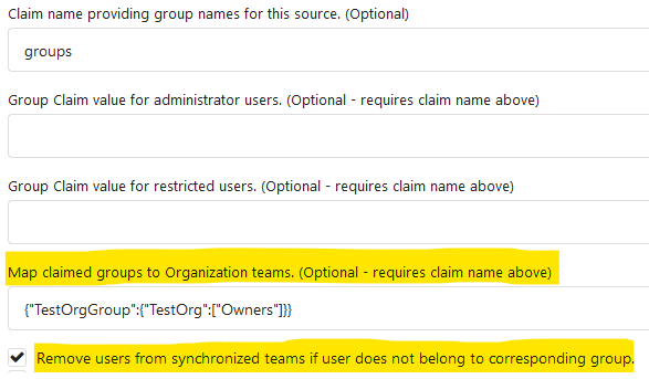
This PR implements the mapping of user groups provided by OIDC providers
to orgs teams in Gitea. The main part is a refactoring of the existing
LDAP code to make it usable from different providers.
Refactorings:
- Moved the router auth code from module to service because of import
cycles
- Changed some model methods to take a `Context` parameter
- Moved the mapping code from LDAP to a common location
I've tested it with Keycloak but other providers should work too. The
JSON mapping format is the same as for LDAP.

---------
Co-authored-by: Lunny Xiao <xiaolunwen@gmail.com>
partially fix #19345

This PR add some `Link` methods for different objects. The `Link`
methods are not different from `HTMLURL`, they are lack of the absolute
URL. And most of UI `HTMLURL` have been replaced to `Link` so that users
can visit them from a different domain or IP.

This PR also introduces a new javascript configuration
`window.config.reqAppUrl` which is different from `appUrl` which is
still an absolute url but the domain has been replaced to the current
requested domain.
Added a new captcha(cloudflare turnstile) and its corresponding
document. Cloudflare turnstile official instructions are here:
https://developers.cloudflare.com/turnstile

Signed-off-by: ByLCY <bylcy@bylcy.dev>
Co-authored-by: Lunny Xiao <xiaolunwen@gmail.com>
Co-authored-by: Jason Song <i@wolfogre.com>
This PR fixes two problems. One is when filter repository issues, only
repository level projects are listed. Another is if you list open
issues, only open projects will be displayed in filter options and if
you list closed issues, only closed projects will be displayed in filter
options.

In this PR, both repository level and org/user level projects will be
displayed in filter, and both open and closed projects will be listed as
filter items.

---------

Co-authored-by: John Olheiser <john.olheiser@gmail.com>
Co-authored-by: zeripath <art27@cantab.net>
Co-authored-by: delvh <dev.lh@web.de>
Same to https://github.com/go-gitea/gitea/pull/22674 and
https://github.com/go-gitea/gitea/pull/22605

Sorry to create 3 PR to fix this.
I checked all span with class `org-visibility`, i think this is the last
one :)

And I found that private/limited user has no private/limited tag in
dashboard. but org does.
If it is ok i will add this feature in another pr.

Co-authored-by: 6543 <6543@obermui.de>
Co-authored-by: Lunny Xiao <xiaolunwen@gmail.com>
Fixes #22183
Replaces #22187

This PR adds secrets for users. I refactored the files for organizations
and repos to use the same logic and templates. I splitted the secrets
from deploy keys again and reverted the fix from #22187.

---------

Co-authored-by: Lunny Xiao <xiaolunwen@gmail.com>
EDIT: The main change of this PR was resolved by #22599. This
complements that PR for some cases without label and complicated layout
to be added.

NOTE: Contributed by @Forgejo.
The use of ui colors (red, green, etc) should be limited to actionable
or dismissable entries. Before this commit, a green/red label was used
to display issues count on each repository. This did not add any
meaningful information to the list.
Removing the label reduces ambiguity and makes the list easier to scan
visually.

---------
Co-authored-by: delvh <dev.lh@web.de>
Don't generate nested `<p>`, use `<div>` like description on the user
profile page.

Co-authored-by: Jason Song <i@wolfogre.com>
Co-authored-by: Lunny Xiao <xiaolunwen@gmail.com>
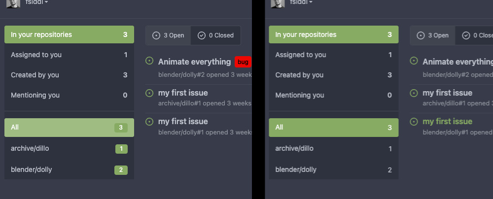
Currently only a single project like milestone, not multiple like
labels.

Implements #14298

Code by @brechtvl

---------

Co-authored-by: Brecht Van Lommel <brecht@blender.org>
Added ARIA navigation landmark to navigation bar and aria label for both
nav bar and footer.

Contributed by @forgejo.

---------

Co-authored-by: Lunny Xiao <xiaolunwen@gmail.com>
On activating local accounts, the error message didn't differentiate
between using a wrong or expired token, or a wrong password. The result
could already be obtained from the behaviour (different screens were
presented), but the error message was misleading and lead to confusion
for new users on Codeberg with Forgejo.

Now, entering a wrong password for a valid token prints a different
error message.

The problem was introduced in 0f14f69e60.

Co-authored-by: Lunny Xiao <xiaolunwen@gmail.com>