Hello,

It is more idiomatic to put the date/time before the action in Mandarin (in this context). To achieve this, instead of having the time following the string that's passed to the translating function, I added it as a parameter so that one can reference it and reorder the sentence for better translatability.

Only Traditional Chinese has been changed at the time of opening this PR, as this is more of a proof of concept and I would like to have feedbacks on whether this is a good solution or is there a better alternative.

Thank you and have a nice day :)

Reviewed-on: https://codeberg.org/forgejo/forgejo/pulls/3837
Reviewed-by: Earl Warren <earl-warren@noreply.codeberg.org>
Reviewed-by: 0ko <0ko@noreply.codeberg.org>
Co-authored-by: Léana 江 <leana.jiang+git@icloud.com>
Co-committed-by: Léana 江 <leana.jiang+git@icloud.com>
Fixes: https://github.com/go-gitea/gitea/issues/29981. Introduce
`.secondary-nav` as a universal way for styling and margin adjustments
inside `.page-content`.

If the first child of `.page-content` is `.secondary-nav`, we add margin
below it, otherwise we add padding to the first child. Notable changes:

- `--color-header-wrapper` is replaced with `--color-secondary-nav-bg`.
- `navbar` class is removed.

Co-authored-by: Giteabot <teabot@gitea.io>
Co-authored-by: wxiaoguang <wxiaoguang@gmail.com>

---

Conflict resolution: Trivial conflict & changed selector to reflect new
classes.
Ref: https://codeberg.org/forgejo/forgejo/issues/2776
(cherry picked from commit 3ccda41a539b8ba7841919ee12dc2877ddc03818)
1. Use general "mobile-only" and "not-mobile" CSS styles, remove some`@media (max-width: 767.98px)` tricks
2. Use `CountFmt` for repo list, just like the repo header (and it matches GitHub, to avoid big numbers bloat the page)

(cherry picked from commit bfa160fc98a23923b6ce1cd4d99e8970d937d6ec)

Conflicts:
	templates/explore/repo_list.tmpl
	templates/repo/header.tmpl
	web_src/css/repo/header.css

 Resolved the template conflicts by porting the changes to Forgejo (in
 case of `header.tmpl`, applying the changes in `header_fork.tmpl). In
 case of the CSS change, opted to take Gitea's version and drop the
 entire media query.
Fixes https://github.com/go-gitea/gitea/issues/30005. Regression from
https://github.com/go-gitea/gitea/pull/29945.

There was only once instance of `tw-content-center` before that PR, so I
just ran below command and reverted that one instance.

```sh
perl -p -i -e 's#tw-content-center#tw-items-center#g' web_src/js/**/* templates/**/* models/**/* tests/**/*
```

(cherry picked from commit 04f9ad056882fc3f21b247b16f84437adf0f36d8)

Conflicts:
	templates/repo/diff/conversation.tmpl
	templates/repo/header.tmpl
	templates/repo/issue/filter_list.tmpl
	templates/repo/issue/view_content/conversation.tmpl
	templates/repo/wiki/view.tmpl
	web_src/js/components/DashboardRepoList.vue
	re-ran the command after discarding the Gitea changes to
	ensure all Forgejo files are also covered
In HTML, `?key=val` already means "use the current link with new query parameters"

(cherry picked from commit 4c476fa41dc29dc24afda0925023ae3d0b9707cd)

Conflicts:
	templates/repo/issue/filter_list.tmpl
	templates/shared/issuelist.tmpl
	trivial context conflict because the lines in Forgejo have rel=nofollow
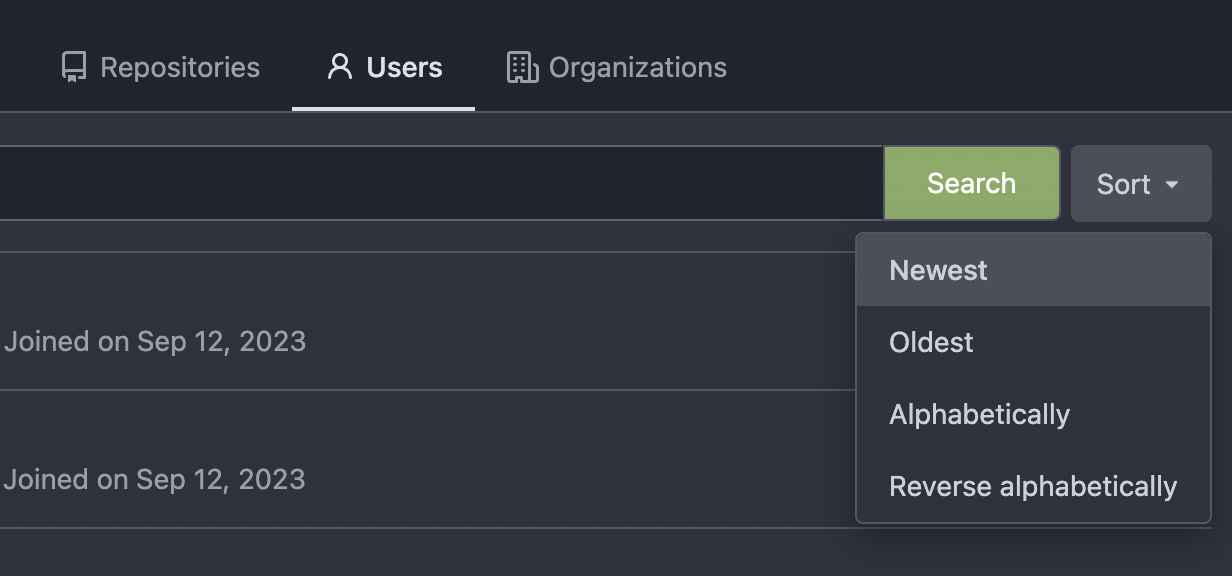
Thanks to inferenceus : some sort orders on the "explore/users" page
could list users by their lastlogintime/updatetime.
It leaks user's activity unintentionally. This PR makes that page only
use "supported" sort orders.
Removing the "sort orders" could also be a good solution, while IMO at
the moment keeping the "create time" and "name" orders is also fine, in
case some users would like to find a target user in the search result,
the "sort order" might help.

(cherry picked from commit eedb8f41297c343d6073a7bab46e4df6ee297a90)
Follow #29165

* some of them are incorrect, which would lead to double escaping (eg:
`(print (Escape $.RepoLink)`)
* other of them are not necessary, because `Tr` handles strings&HTML
automatically

Suggest to review by "unified view":
https://github.com/go-gitea/gitea/pull/29394/files?diff=unified&w=0

(cherry picked from commit d2f6588b66549b33adf8bac7044d03c89d668470)

Conflicts:
	templates/code/searchcombo.tmpl
	templates/mail/auth/register_notify.tmpl
	templates/mail/issue/default.tmpl
	templates/repo/code/recently_pushed_new_branches.tmpl
	templates/repo/search.tmpl
	templates/repo/settings/protected_branch.tmpl
	templates/user/auth/activate.tmpl
	templates/user/auth/forgot_passwd.tmpl
	templates/user/dashboard/feeds.tmpl
	context
- If the user is searching repositories with an specific topic, adding
any other filter option, such as showing unrelevant repositories or
using another sort Forgejo should remember that 'topic only' was set.
- Adds integration test.
- Resolves #2461
For small, personal self-hosted instances with no user signups, the fork
button is just a noise. This patch allows disabling them like stars can
be disabled too.

Disabling forks does not only remove the buttons from the web UI, it
also disables the routes that could be used to create forks.

Fixes #2441.

Signed-off-by: Gergely Nagy <forgejo@gergo.csillger.hu>
The `.new-menu` was using a pseudo-element based fade-out effect.
Replace this with a more modern mask-based effect which in this case
required a child element to avoid fading out the background as well, so
I applied it to child `new-menu-inner` which was present on all these
menus except explore where I added it.

There is no visual difference except that the items on the explore page
have no `gap` between them any longer, making it consistent with other
menus. Before and after:

<img width="221" alt="Screenshot 2023-09-21 at 21 13 19"
src="https://github.com/go-gitea/gitea/assets/115237/b4a38ce2-cee1-4c54-84a5-e1d0bfd79e29">
<img width="222" alt="Screenshot 2023-09-21 at 21 32 36"
src="https://github.com/go-gitea/gitea/assets/115237/bb6b1335-d935-4ad4-bb85-3b0fc3027c2b">

Also, this cleans up the related CSS vars:

- `--color-header-wrapper-transparent` is removed, no longer needed
- `--color-header-wrapper` is defined in base theme as well, was
previously unset and therefor transparent.

[no whitespace
diff](https://github.com/go-gitea/gitea/pull/27181/files?diff=unified&w=1)
[demo of mask fade](https://jsfiddle.net/silverwind/tsfadb3u/)
1. There is already `gt-ac`, so no need to introduce `flex-item-center`
2. The `flex-item-baseline` and `.flex-item-icon svg { margin-top: 1px
}` seem to be a tricky patch, they don't resolve the root problem, and
still cause misalignment in some cases.
* The root problem is: the "icon" needs to align with the sibling
"title"
* So, make the "icon" and the "title" both have the same height
3. `flex-text-inline` could only be used if the element is really
"inline", otherwise its `vertical-align` would make the box size change.
In most cases, `flex-text-block` is good enough.

---------
Co-authored-by: silverwind <me@silverwind.io>
Co-authored-by: Giteabot <teabot@gitea.io>
This PR implements a proposal to clean up the admin users table by
moving some information out to a separate user details page (which also
displays some additional information).
Other changes:
- move edit user page from `/admin/users/{id}` to
`/admin/users/{id}/edit` -> `/admin/users/{id}` now shows the user
details page
- show if user is instance administrator as a label instead of a
separate column
- separate explore users template into a page- and a shared one, to make
it possible to use it on the user details page
- fix issue where there was no margin between alert message and
following content on admin pages
<details>
<summary>Screenshots</summary>


</details>
Partially resolves #25939
---------
Co-authored-by: Giteabot <teabot@gitea.io>
- Set
[type=search](https://developer.mozilla.org/en-US/docs/Web/HTML/Element/input/search)
- Disable spellcheck
- Set maxLength 255 that I found in `templates/repo/issue/search.tmpl`
- Remove unnecessary `max-width`, it does nothing

---------

Co-authored-by: delvh <dev.lh@web.de>
Co-authored-by: Giteabot <teabot@gitea.io>