Earl Warren
02ba08ca84
[BRANDING] define the forgejo webhook type
...
templates/swagger/v1_json.tmpl updated with `make generate-swagger`
(cherry picked from commit 88899c492e7171bd96171a742446c1d7c189d7b2cbdea868e46cd150483b47246da8d3f2aa0e6b765a4fc69a1648e444ca09888e5378115121f493c99394e55fdf3a2ce51768719ead3a6583e6f82e2a494a429b21d30c90c0ab3c83b325c4470bffae631d65921719c101c2e0b9
2023-07-17 00:25:56 +02:00
silverwind
ee26d1c578
Button and color enhancements ( #24989 ) ( #25176 )
...
Backport #24989 . Clean cherry-pick aside from one small conflict with
divider.
- Various corrections to button styles, especially secondary
- Remove focus highlight, it's annoying when it stays on button after
press
- Clearly define ghost and link buttons with demos in devtest
- Remove black, grey and tertiary buttons, they should not be used
- Make `arc-green` slightly darker
<img width="1226" alt="image"
src="https://github.com/go-gitea/gitea/assets/115237/8d89786a-01ab-40f8-ae5a-e17f40e35084 ">
<img width="1249" alt="image"
src="https://github.com/go-gitea/gitea/assets/115237/83651e6d-3c27-46ff-b8bd-ff344d70e949 ">
2023-06-11 02:13:08 +00:00
Giteabot
18093d4c9a
Fix mobile navbar and misc cleanups ( #25134 ) ( #25169 )
...
Backport #25134 by @silverwind
- Fix and improve mobile navbar layout
- Apply all cleanups suggested in
https://github.com/go-gitea/gitea/pull/25111
- Make media query breakpoints match Fomantic's exactly
- Clean up whitespace in class on navbar items
Mobile navbar before and after:
<img width="745" alt="Screenshot 2023-06-08 at 08 40 56"
src="https://github.com/go-gitea/gitea/assets/115237/ca84b239-b10f-41db-8c06-dcf2b6dd9d28 ">
<img width="739" alt="Screenshot 2023-06-08 at 08 41 23"
src="https://github.com/go-gitea/gitea/assets/115237/09133c54-eb7e-4110-858c-ead23c3b7521 ">
2023-06-11 09:50:39 +08:00
HesterG
58536093b3
Add details summary for vertical menus in settings to allow toggling ( #25098 )
...
Close #25051
[referenced
answer](https://stackoverflow.com/questions/10813581/can-i-replace-the-expand-icon-of-the-details-element/69722686#69722686 )
for marker overwrite. One limitation is that fomantic does not have
hover and active effects for the vertical submenu
([reference](https://fomantic-ui.com/collections/menu.html#sub-menu )).
And we might need to overwrite some styles if hover and active effects
are needed.
Update:
Used `data:image/svg` instead of `marker` content. And adjusted styles
for hover effect.
Take admin settings as an example:
https://github.com/go-gitea/gitea/assets/17645053/63f69823-ef43-47d5-a518-544b5ea35ba6
---------
Co-authored-by: silverwind <me@silverwind.io>
2023-06-07 10:49:48 +08:00
delvh
bf27fc3596
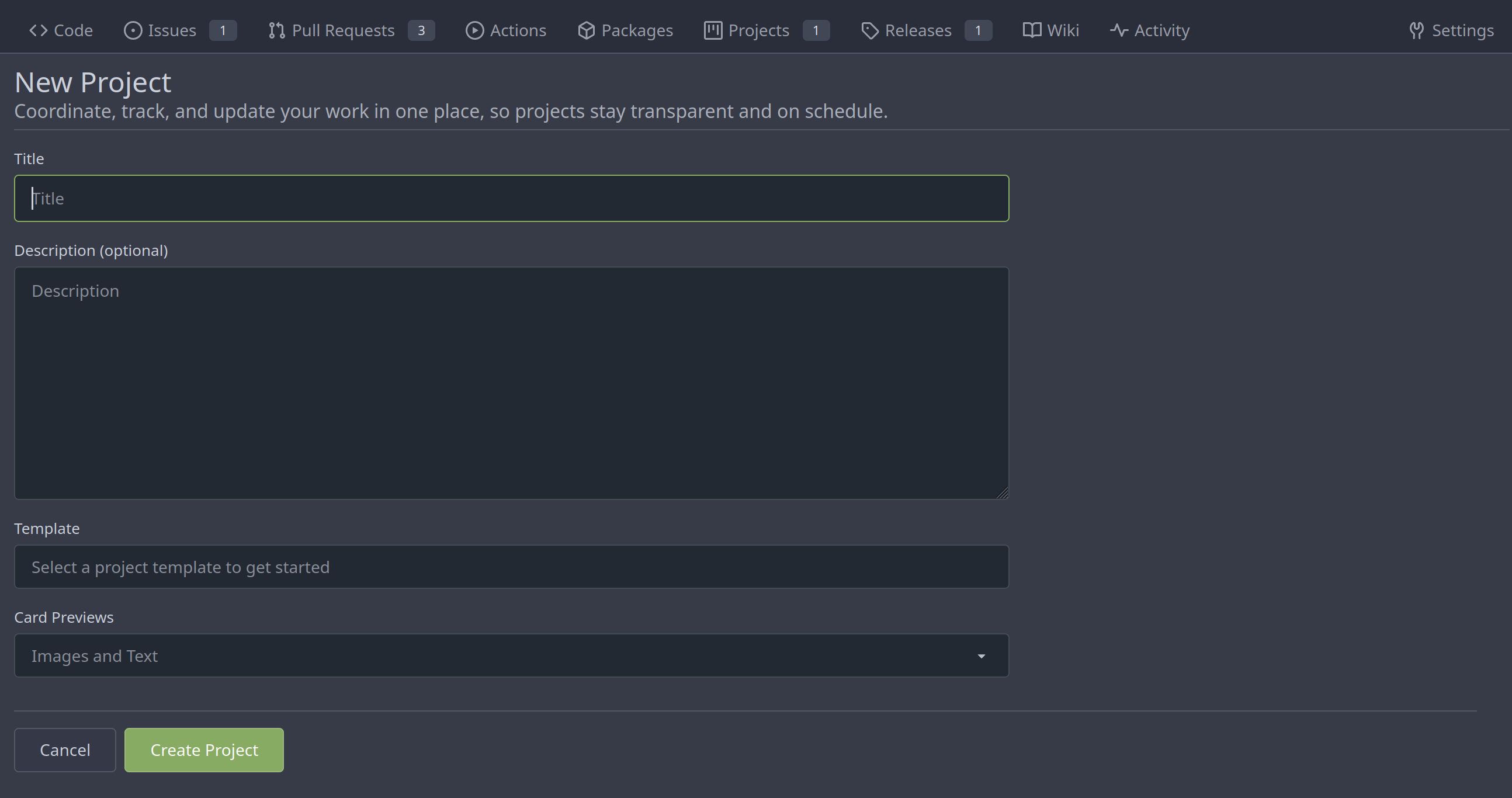
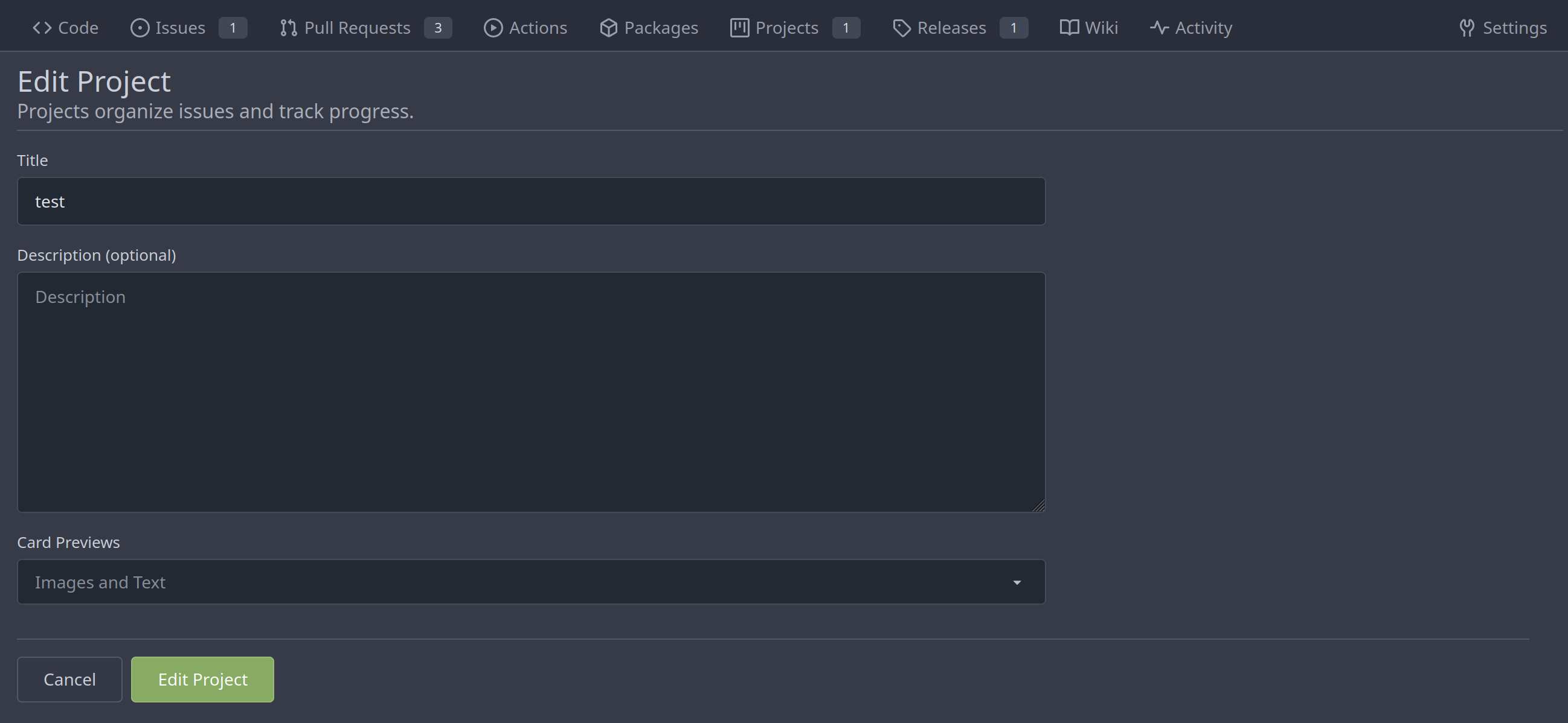
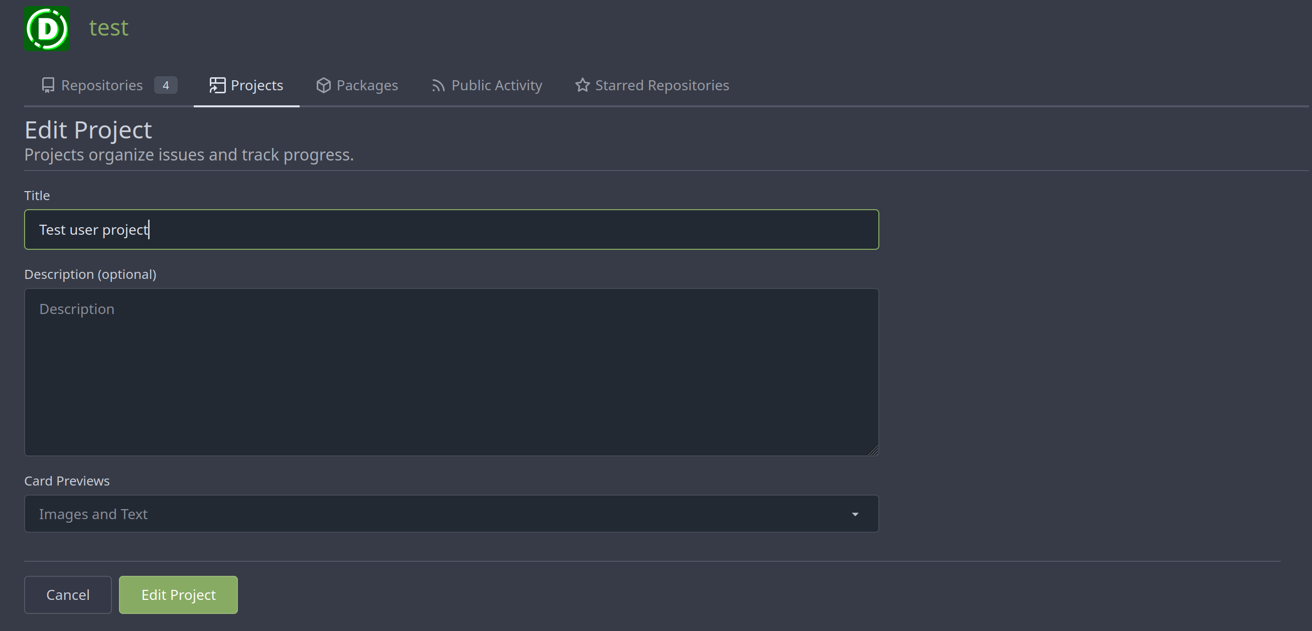
Merge new project templates into one ( #24985 )
...
Additionally simplify the `new project` template slightly.
Review hint: Disable whitespace changes.
<details><summary>Before</summary>
## New repo project

## Edit repo project

## New user/org project

## Edit user/org project

</details>
<details><summary>After</summary>
## New repo project
## Edit repo project
## New user/org project

## Edit user/org project
</details>
---------
Co-authored-by: Giteabot <teabot@gitea.io>
2023-05-31 08:50:18 +02:00
JakobDev
85fa954a38
Improve some Forms ( #24878 )
...
Don't really know a better name for this. I've gone through some Forms
and added missing HTML attributes (mostly `maxlength`). I tried to fill
the Forms with dummy Data and see if Gitea throws a Error (e.g. maximum
length). If yes, I added the missing HTML attribute.

While working on this, I discovered that the Form to add OAuth2 Apps
just silently fails when filled with invalid data, so I fixed that too.
2023-05-26 09:42:54 +00:00
silverwind
a96c73f979
Remove svg.svg class, restore .rss-icon ( #24667 )
...
Fix regression from https://github.com/go-gitea/gitea/pull/24476 where
the `svg.svg` class misaligns SVG icons across the site and streched
buttons unintentionally in vertical height.
Before (button 30.3px):
<img width="157" alt="Screenshot 2023-05-11 at 22 09 42"
src="https://github.com/go-gitea/gitea/assets/115237/0fd137ab-ab52-4cf8-afca-c45776d526d0 ">
After (button 30px):
<img width="160" alt="Screenshot 2023-05-11 at 22 09 59"
src="https://github.com/go-gitea/gitea/assets/115237/4b741f4b-0fd2-4fae-9bee-16a7deb098e8 ">
[vertical-align:
middle](https://developer.mozilla.org/en-US/docs/Web/CSS/vertical-align )
is not suitable to align icons to text because
> Aligns the middle of the element with the baseline plus half the
x-height of the parent.
Example of `vertical-align: middle` from MDN:
<img width="232" alt="Screenshot 2023-05-11 at 22 29 28"
src="https://github.com/go-gitea/gitea/assets/115237/179fb756-85a1-4cab-8219-1a4958f333e2 ">
So I think the
[existing](365bb77a54/web_src/css/svg.css (L3)https://github.com/go-gitea/gitea/assets/115237/0cd6edf5-12c0-4bdb-8771-a900f5ba2d35 ">
Co-authored-by: Giteabot <teabot@gitea.io>
2023-05-12 10:23:53 +00:00
silverwind
67db6b6976
RSS icon fixes ( #24476 )
...
Fix regression from https://github.com/go-gitea/gitea/pull/24471 where
CSS rules for `.icon.grey` were removed which were in use by the RSS
icons.
Gave them their own class instead, removed a wrapper and also fixed
vertical alignment on them. Additionally, did a few related fixes on the
org header for alignment.
Fixes: https://github.com/go-gitea/gitea/issues/24584
<img width="196" alt="Screenshot 2023-05-01 at 22 39 40"
src="https://user-images.githubusercontent.com/115237/235528228-959e2385-c1d2-4d5c-baec-e3784d459653.png ">
<img width="216" alt="Screenshot 2023-05-01 at 22 44 20"
src="https://user-images.githubusercontent.com/115237/235528231-95cbff86-5672-48eb-b214-8bdcefa1612c.png ">
<img width="120" alt="Screenshot 2023-05-01 at 22 56 36"
src="https://user-images.githubusercontent.com/115237/235529844-b94ab554-3259-4d0c-b040-82aed7d1a111.png ">
<img width="372" alt="Screenshot 2023-05-01 at 22 54 25"
src="https://user-images.githubusercontent.com/115237/235529744-1a9c201b-5692-4122-9765-2f201a322a9e.png ">
<img width="477" alt="Screenshot 2023-05-01 at 22 55 28"
src="https://user-images.githubusercontent.com/115237/235529748-62188554-9927-42ef-bc94-7052bce266e2.png ">
---------
Co-authored-by: wxiaoguang <wxiaoguang@gmail.com>
2023-05-10 22:27:02 +00:00
Lunny Xiao
3ee7f27341
Revert "Prevent a user with a different email from accepting the team invite" ( #24531 )
...
Reverts go-gitea/gitea#24491
2023-05-05 15:59:12 +08:00
Jack Hay
402df1d6b4
Prevent a user with a different email from accepting the team invite ( #24491 )
...
## Changes
- Fixes the case where a logged in user can accept an email invitation
even if their email address does not match the address in the invitation
2023-05-03 21:21:58 -04:00
silverwind
4a722c9a45
Make Issue/PR/projects more compact, misc CSS tweaks ( #24459 )
...
- Remove various horizontal dividers on repo pages that didn't provide
visual benefit
- Remove label/milestone pills on single issue/pr page
- Remove issue-related pill buttons on projects page
- Increase contrast of color-secondary on arc-green
- Improve notifications icon, make circle bigger
- Remove some inline styles
- Fix focus in issue/pr title edit and select all text on button click
### Issue and PR before and after
<img width="1249" alt="Screenshot 2023-05-01 at 11 44 22"
src="https://user-images.githubusercontent.com/115237/235436662-a708288e-84fb-4b2e-a5a2-3a1c17d28f6c.png ">
<img width="1248" alt="Screenshot 2023-05-01 at 11 58 51"
src="https://user-images.githubusercontent.com/115237/235437992-f863e483-f3cc-4cc1-8204-fd223647a0c9.png ">
### Projects before and after
<img width="1255" alt="Screenshot 2023-05-01 at 11 41 02"
src="https://user-images.githubusercontent.com/115237/235436433-0deb85d6-4e7d-4e74-847f-254cc70a0cf9.png ">
<img width="1267" alt="Screenshot 2023-05-01 at 11 40 03"
src="https://user-images.githubusercontent.com/115237/235436431-715b13cb-f78c-4d86-b27a-9229f9738c5b.png ">
### Releases before and after
<img width="1243" alt="Screenshot 2023-05-01 at 11 41 12"
src="https://user-images.githubusercontent.com/115237/235436457-b655ee6f-03b8-4595-8d8c-b15ea469e988.png ">
<img width="1240" alt="Screenshot 2023-05-01 at 11 40 10"
src="https://user-images.githubusercontent.com/115237/235436456-05a2a0dd-7cbb-4f26-b0d3-4f667df4bb95.png ">
### Misc
<img width="58" alt="Screenshot 2023-05-01 at 10 49 13"
src="https://user-images.githubusercontent.com/115237/235432494-936ce995-6e22-47bc-ab2d-c9e93d31987d.png ">
<img width="57" alt="Screenshot 2023-05-01 at 18 57 08"
src="https://user-images.githubusercontent.com/115237/235492430-1d32cfe0-0f2c-467c-b2fa-925b27e30e0e.png ">
Issue title edit and wrap:
<img width="1238" alt="Screenshot 2023-05-01 at 12 34 40"
src="https://user-images.githubusercontent.com/115237/235441407-d5067a57-e586-4865-a652-282e5944abb4.png ">
<img width="1232" alt="Screenshot 2023-05-01 at 12 06 24"
src="https://user-images.githubusercontent.com/115237/235438710-1a543dda-220f-4d87-8f93-f1710c0695f0.png ">
---------
Co-authored-by: wxiaoguang <wxiaoguang@gmail.com>
2023-05-03 17:58:59 -04:00
KN4CK3R
df00ccacc9
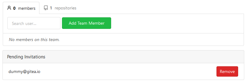
Fix invite display ( #24447 )
...
Regression of #23901
Before

After
---------
Co-authored-by: Giteabot <teabot@gitea.io>
2023-05-02 09:59:31 +02:00
yp05327
cc64a92560
Add follow organization and fix the logic of following page ( #24345 )
...


Maybe we can fix user card tmpl in #24319 ?
Or maybe a list is better here

---------
Co-authored-by: silverwind <me@silverwind.io>
Co-authored-by: Giteabot <teabot@gitea.io>
2023-04-29 15:13:58 -04:00
wxiaoguang
5a5ab8ef5a
Start cleaning the messy ".ui.left / .ui.right", improve label list page, fix stackable menu ( #24393 )
...
Since 2015/2016, there is a global pollution: ".ui.left" / ".ui.right".
Fomantic UI doesn't work this way, it just conflicts with many Fomantic
definitions.
This PR starts the cleaning work of such techinical debts.
And, the "label list" page has been quite messy for long time, for
example, why "li" appears in "div" ......
And fix #24296
<details>


</details>
2023-04-29 07:35:59 -04:00
Hester Gong
63a401ac40
Move secrets and runners settings to actions settings ( #24200 )
...
This PR moves the secrets and runners settings to actions settings on
all settings(repo,org,user,admin) levels.
After this PR, if
[ENABLED](5e7543fcf4/custom/conf/app.example.ini (L2604)https://user-images.githubusercontent.com/17645053/234489731-15822d21-38e1-4560-8bbe-69f122376abc.png ">
2. User Level
"Secrets Management"
<img width="1427" alt="Screen Shot 2023-04-26 at 14 34 30"
src="https://user-images.githubusercontent.com/17645053/234489795-68c9c0cb-24f8-4f09-95c6-458ab914c313.png ">
3. Repo and Organization Levels
"Runners Management" and "Secrets Management"
Org:
<img width="1437" alt="Screen Shot 2023-04-26 at 14 35 07"
src="https://user-images.githubusercontent.com/17645053/234489996-f3af5ebb-d354-46ca-9087-a0b586845281.png ">
<img width="1433" alt="Screen Shot 2023-04-26 at 14 35 14"
src="https://user-images.githubusercontent.com/17645053/234490004-3abf8fed-81fd-4ce2-837a-935dade1793d.png ">
Repo:
<img width="1419" alt="Screen Shot 2023-04-26 at 14 34 50"
src="https://user-images.githubusercontent.com/17645053/234489904-80c11038-4b58-462c-9d0b-8b7cf70bc2b3.png ">
<img width="1430" alt="Screen Shot 2023-04-26 at 14 34 57"
src="https://user-images.githubusercontent.com/17645053/234489918-4e8d1fe2-9bcd-4d8a-96c1-238a8088d92e.png ">
It also finished these tasks :
- [x] rename routers function "runners" to "actions", and refactor
related file names
- [x] check and modify part of the runners related functions to match
their name
- [x] Fix backend check caused by fmt check
---------
Co-authored-by: wxiaoguang <wxiaoguang@gmail.com>
2023-04-27 20:08:47 -04:00
Hester Gong
f1a4330306
Modify width of ui container, fine tune css for settings pages and org header ( #24315 )
...
Close #24302
Part of #24229 , Follows #24246
This PR focused on CSS style fine-tune, main changes:
1. Give `.ui.ui.ui.container` a width of `1280px` with a max-width of
`calc(100vw - 64px)`, so the main contents looks better on large
devices.
2. Share styles for table elements in all levels settings pages to fix
overflow of runners table on mobile and for consistency (The headers on
mobile can be further improved, but haven't found a proper way yet).
3. Use [stackable
grid](https://fomantic-ui.com/collections/grid.html#stackable ) and
[device column width](https://fomantic-ui.com/examples/responsive.html )
for responsiveness for some pages (repo/org collaborators settings
pages, org teams related page)
4. Fixed #24302 by sharing label related CSS in reporg.css
5. Fine tune repo tags settings page
---------
Co-authored-by: wxiaoguang <wxiaoguang@gmail.com>
2023-04-26 11:59:08 -04:00
wxiaoguang
75c62054a6
Improve some modal action buttons ( #24289 )
...
Follow #24097 and #24285
And add a devtest page for modal action button testing.
http://localhost:3000/devtest/fomantic-modal
Now the `modal_actions_confirm.tmpl` could support: green / blue /
yellow positive buttons, the negative button is "secondary".
ps: this PR is only a small improvement, there are still a lot of
buttons not having proper colors. In the future these buttons could be
improved by this approach.
These buttons could also be improved according to the conclusion of
#24285 in the future.

And add GitHub-like single danger button (context:
https://github.com/go-gitea/gitea/issues/24285#issuecomment-1519100312 )

---------
Co-authored-by: silverwind <me@silverwind.io>
2023-04-24 07:08:59 -04:00
Hester Gong
44e0cfa96e
Change to vertical navbar layout for secondary navbar for repo/user/admin settings ( #24246 )
...
Co-Author: @wxiaoguang
This is the first step of #24229 . And this PR will only includes html
changes, and followed by other PRs that fine tune css and change to
submenus.
After:
Admin Level
<img width="1400" alt="Screen Shot 2023-04-21 at 10 07 16"
src="https://user-images.githubusercontent.com/17645053/233523870-f848b61d-056a-4b41-9760-a9a49fea1fe8.png ">
User Level
<img width="1422" alt="Screen Shot 2023-04-21 at 10 07 23"
src="https://user-images.githubusercontent.com/17645053/233523878-979adb20-a657-43d9-99a6-ad414010c0ef.png ">
Repo Level
<img width="1404" alt="Screen Shot 2023-04-21 at 10 07 07"
src="https://user-images.githubusercontent.com/17645053/233523863-337440bd-c03a-4dfd-87fa-cef40300bfe0.png ">
---------
Co-authored-by: wxiaoguang <wxiaoguang@gmail.com>
2023-04-23 18:21:21 +08:00
Hester Gong
476a043a5f
Refactor delete_modal_actions template and use it for project column related actions ( #24097 )
...
Co-Author: @wxiaoguang
This PR is to fix
https://github.com/go-gitea/gitea/issues/23318#issuecomment-1506275446 .
The way to fix this in this PR is to use `delete_modal_actions.tmpl`
here both to fix this issue and keep ui consistency (as suggested by
[TODO
here](4299c3b7db/templates/projects/view.tmpl (L161)https://user-images.githubusercontent.com/17645053/233825650-76307e65-9255-44bb-80e8-7062f58ead1b.png ">
<img width="786" alt="Screen Shot 2023-04-23 at 15 17 21"
src="https://user-images.githubusercontent.com/17645053/233825652-4dc6f7d1-a180-49fb-a468-d60950eaee0d.png ">
Test for functionalities:
https://user-images.githubusercontent.com/17645053/233826857-76376fda-022c-42d0-b0f3-339c17ca4e59.mov
---------
Co-authored-by: wxiaoguang <wxiaoguang@gmail.com>
2023-04-23 17:24:19 +08:00
JakobDev
02119ec95e
Limit avatar upload to valid image files ( #24258 )
...
This causes the browser to allow only valid images in the file picker by
default.

---------

Co-authored-by: silverwind <me@silverwind.io>
2023-04-21 17:58:59 -04:00
wxiaoguang
70fc47a22a
Fix unclear "Owner" concept ( #24233 )
...
Some user/org pages use `Owner` variable. It's an incorrect concept
since year 2016: what is a user's owner?
Actually, new code is right: use `ContextUser`.
This PR cleans all legacy "Owner" variables.
## Screenshots for related pages and test results
All pages are as before:
### `web/org/home.go`

### `web/user/profile.go`

### `web/user/setting/profile.go`

2023-04-20 19:33:30 +02:00
Jakob
52b17bfa07
Add repository counter badge to repository tab ( #24205 )
...
Add a new badge to the repository tab for users and organizations.
The badge is only visible if a repo exists.

Change the badge color of existing "Starred Repositories". (from primary to small)

Closes #24188
2023-04-19 14:58:36 -04:00
Hester Gong
7ca7590c39
Fix duplicate modals when clicking on "remove all" repository button ( #24129 )
...
Under Team tab of an organization, click on "remove all" repositories
button will trigger two modals. Because `data-modal-id` is not proerly
added.

Before:

https://user-images.githubusercontent.com/17645053/231988545-ac690b86-e3fe-4bf5-81c6-5ef09302e849.mov

After:

https://user-images.githubusercontent.com/17645053/231989678-53be4f91-fdc9-4bc5-ba11-a08aa4548e37.mov
2023-04-19 00:49:49 +08:00
wxiaoguang
f20057271d
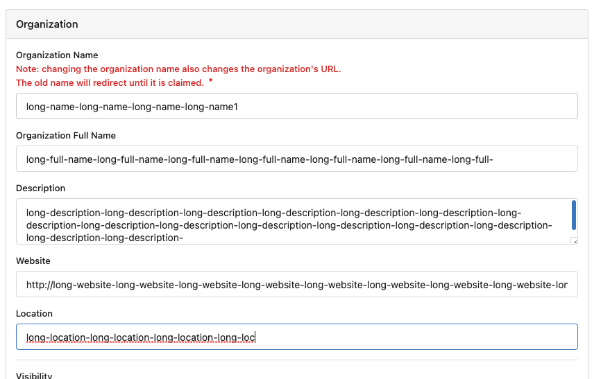
Fix Org edit page bugs: renaming detection, maxlength ( #24161 )
...
## Before
* The renaming detection is wrong (eg: pasting a new name into the input
doesn't trigger the detection)
* The renaming prompt layout is not good
* Some MaxSize/maxlength rules is missing


## After
* Fix these problems
2023-04-17 11:35:57 -04:00
yp05327
b7221bec34
Fix admin team access mode value in team_unit table ( #24012 )
...
Same as https://github.com/go-gitea/gitea/pull/23675
Feedback:
https://github.com/go-gitea/gitea/pull/23879#issuecomment-1500923636
2023-04-13 21:06:10 +02:00
wxiaoguang
36c0840cf1
Merge template functions "dict/Dict/mergeinto" ( #23932 )
...
One of the steps in #23328


Before there were 3 different but similar functions: dict/Dict/mergeinto

The code was just copied & pasted, no test.

This PR defines a new stable `dict` function, it covers all the 3 old
functions behaviors, only +160 -171


Future developers do not need to think about or guess the different dict
functions, just use one: `dict`

Why use `dict` but not `Dict`? Because there are far more `dict` than
`Dict` in code already ......
2023-04-07 09:39:08 -05:00
silverwind
62a9052075
Org pages style fixes ( #23901 )
...
Few fixes/enhancements around org pages:
Use flexbox for member and repo lists and tweak rendering of tabs and
list:
<img width="765" alt="Screenshot 2023-04-03 at 22 54 24"
src="https://user-images.githubusercontent.com/115237/229625716-92a834c3-9121-4729-8b9b-3a3973cf9a91.png ">
<img width="771" alt="Screenshot 2023-04-03 at 22 55 15"
src="https://user-images.githubusercontent.com/115237/229625719-acc08ce8-4489-44a6-a9b9-e36755c55b1d.png ">
Vertically center remove/leave buttons, add link to avatar:
<img width="1223" alt="Screenshot 2023-04-03 at 21 51 20"
src="https://user-images.githubusercontent.com/115237/229612616-b662b795-e754-41a1-a77a-381c267e6104.png ">
2023-04-04 06:49:09 +02:00
wxiaoguang
31ab331b23
Remove incorrect HTML self close tag ( #23748 )
...
HTML is not XML.
2023-03-27 18:05:51 +02:00
wxiaoguang
8d5fbeb7a2
Use data-tooltip-content for tippy tooltip ( #23649 )
...
Follow:
* #23574
* Remove all ".tooltip[data-content=...]"

Major changes:

* Remove "tooltip" class, use "[data-tooltip-content=...]" instead of
".tooltip[data-content=...]"
* Remove legacy `data-position`, it's dead code since last Fomantic
Tooltip -> Tippy Tooltip refactoring
* Rename reaction attribute from `data-content` to
`data-reaction-content`
* Add comments for some `data-content`: `{{/* used by the form */}}`
* Remove empty "ui" class
* Use "text color" for SVG icons (a few)
2023-03-24 18:35:38 +08:00
silverwind
34a2cf5079
Replace a few fontawesome icons with svg ( #23602 )
...
Replaced a few icons with SVG. The only ones left are some in actions
(idk why new code introduces legacy icons) and a few dropdown icons.
2023-03-20 21:42:02 -04:00
delvh
81fe5d6185
Convert <div class="button"> to <button class="button"> ( #23337 )
...
This improves a lot of accessibility shortcomings.
Every possible instance of `<div class="button">` matching the command
`ag '<[^ab].*?class=.*?[" ]button[ "]' templates/ | grep -v 'dropdown'`
has been converted when possible.
divs with the `dropdown` class and their children were omitted as
1. more analysis must be conducted whether the dropdowns still work as
intended when they are a `button` instead of a `div`.
2. most dropdowns have `div`s as children. The HTML standard disallows
`div`s inside `button`s.
3. When a dropdown child that's part of the displayed text content is
converted to a `button`, the dropdown can be focused twice
Further changes include that all "gitea-managed" buttons with JS code
received an `e.preventDefault()` so that they don't accidentally submit
an underlying form, which would execute instead of cancel the action.
Lastly, some minor issues were fixed as well during the refactoring.
## Future improvements
As mentioned in
https://github.com/go-gitea/gitea/pull/23337#discussion_r1127277391 ,
`<a>`s without `href` attribute are not focusable.
They should later on be converted to `<button>`s.
---------
Co-authored-by: wxiaoguang <wxiaoguang@gmail.com>
Co-authored-by: silverwind <me@silverwind.io>
Co-authored-by: techknowlogick <techknowlogick@gitea.io>
Co-authored-by: Lunny Xiao <xiaolunwen@gmail.com>
2023-03-14 11:34:09 +08:00
yp05327
cf29ee6dd2
Add missing tabs to org projects page ( #22705 )
...
Fixes https://github.com/go-gitea/gitea/issues/22676
Context Data `IsOrganizationMember` and `IsOrganizationOwner` is used to
control the visibility of `people` and `team` tab.
2871ea0809/templates/org/menu.tmpl (L19-L40)
2023-03-10 09:18:20 -06:00
yp05327
3f547c7afb
Fix incorrect project links and use symlink icon for org-wide projects ( #23325 )
...
Fix displaying same projects icons between user/repo projects.
And fix incorrect projects links.
A part of https://github.com/go-gitea/gitea/pull/22865 .


2023-03-06 10:32:56 -06:00
Brecht Van Lommel
a82b9016c3
Hide 2FA status from other members in organization members list ( #22999 )
...
This is rather private information that should not be given to all
members in the same organization. Only show it to organization owners.
2023-02-20 17:16:29 -06:00
yp05327
b811ab48e5
Add all units to the units permission list in org team members sidebar ( #22971 )
...
Add all units to the units permission list in org team members sidebar.
Before:

After:

Co-authored-by: Lunny Xiao <xiaolunwen@gmail.com>
2023-02-20 15:08:33 +08:00
wxiaoguang
d32af84a10
Refactor hiding-methods, remove jQuery show/hide, remove .hide class, remove inline style=display:none ( #22950 )
...
Close #22847

This PR:

* introduce Gitea's own `showElem` and related functions
* remove jQuery show/hide
* remove .hide class
* remove inline style=display:none

From now on:

do not use:
* "[hidden]" attribute: it's too weak, can not be applied to an element
with "display: flex"
* ".hidden" class: it has been polluted by Fomantic UI in many cases
* inline style="display: none": it's difficult to tweak
* jQuery's show/hide/toggle: it can not show/hide elements with
"display: xxx !important"

only use:
* this ".gt-hidden" class
* showElem/hideElem/toggleElem functions in "utils/dom.js"

cc: @silverwind , this is the all-in-one PR
2023-02-19 12:06:14 +08:00
Yarden Shoham
feed1ff38f
Rename "People" to "Members" in organization page and use a better icon ( #22960 )
...
`member` is how it's named in the code
Closes #22931
Before | After
--- | ---

|

---------
Signed-off-by: Yarden Shoham <hrsi88@gmail.com>
Co-authored-by: delvh <leon@kske.dev>
2023-02-18 21:41:31 +08:00
Lunny Xiao
bd820aa9c5
Add context cache as a request level cache ( #22294 )
...
To avoid duplicated load of the same data in an HTTP request, we can set
a context cache to do that. i.e. Some pages may load a user from a
database with the same id in different areas on the same page. But the
code is hidden in two different deep logic. How should we share the
user? As a result of this PR, now if both entry functions accept
`context.Context` as the first parameter and we just need to refactor
`GetUserByID` to reuse the user from the context cache. Then it will not
be loaded twice on an HTTP request.

But of course, sometimes we would like to reload an object from the
database, that's why `RemoveContextData` is also exposed.

The core context cache is here. It defines a new context
```go
type cacheContext struct {
	ctx  context.Context
	data map[any]map[any]any
        lock sync.RWMutex
}

var cacheContextKey = struct{}{}

func WithCacheContext(ctx context.Context) context.Context {
	return context.WithValue(ctx, cacheContextKey, &cacheContext{
		ctx:  ctx,
		data: make(map[any]map[any]any),
	})
}
```

Then you can use the below 4 methods to read/write/del the data within
the same context.

```go
func GetContextData(ctx context.Context, tp, key any) any
func SetContextData(ctx context.Context, tp, key, value any)
func RemoveContextData(ctx context.Context, tp, key any)
func GetWithContextCache[T any](ctx context.Context, cacheGroupKey string, cacheTargetID any, f func() (T, error)) (T, error)
```

Then let's take a look at how `system.GetString` implement it.

```go
func GetSetting(ctx context.Context, key string) (string, error) {
	return cache.GetWithContextCache(ctx, contextCacheKey, key, func() (string, error) {
		return cache.GetString(genSettingCacheKey(key), func() (string, error) {
			res, err := GetSettingNoCache(ctx, key)
			if err != nil {
				return "", err
			}
			return res.SettingValue, nil
		})
	})
}
```

First, it will check if context data include the setting object with the
key. If not, it will query from the global cache which may be memory or
a Redis cache. If not, it will get the object from the database. In the
end, if the object gets from the global cache or database, it will be
set into the context cache.

An object stored in the context cache will only be destroyed after the
context disappeared.
2023-02-15 21:37:34 +08:00
zeripath
51383ec084
Move helpers to be prefixed with gt- ( #22879 )
...
As discussed in #22847 the helpers in helpers.less need to have a
separate prefix as they are causing conflicts with fomantic styles

This will allow us to have the `.gt-hidden { display:none !important; }`
style that is needed to for the reverted PR.

Of note in doing this I have noticed that there was already a conflict
with at least one chroma style which this PR now avoids.

I've also added in the `gt-hidden` style that matches the tailwind one
and switched the code that needed it to use that.

Signed-off-by: Andrew Thornton <art27@cantab.net>

---------

Signed-off-by: Andrew Thornton <art27@cantab.net>
Co-authored-by: wxiaoguang <wxiaoguang@gmail.com>
2023-02-13 17:59:59 +00:00
wxiaoguang
eb5e1bcd21
Remove Fomantic-UI's .hidden CSS class for checkbox elements ( #22851 )
...
Fomantic-UI's `.hidden` CSS class is badly designed.

* Checkbox elements do not need it in HTML, so this PR removes it (JS
adds the `.hidden` class back by `$('.ui.checkbox').checkbox()`)
* `menu transaction hidden` is still needed, and it should be the only
usage for the `.hidden` from now on (until they get refactored properly)

Co-authored-by: zeripath <art27@cantab.net>
2023-02-13 11:16:59 +08:00
KN4CK3R
df789d962b
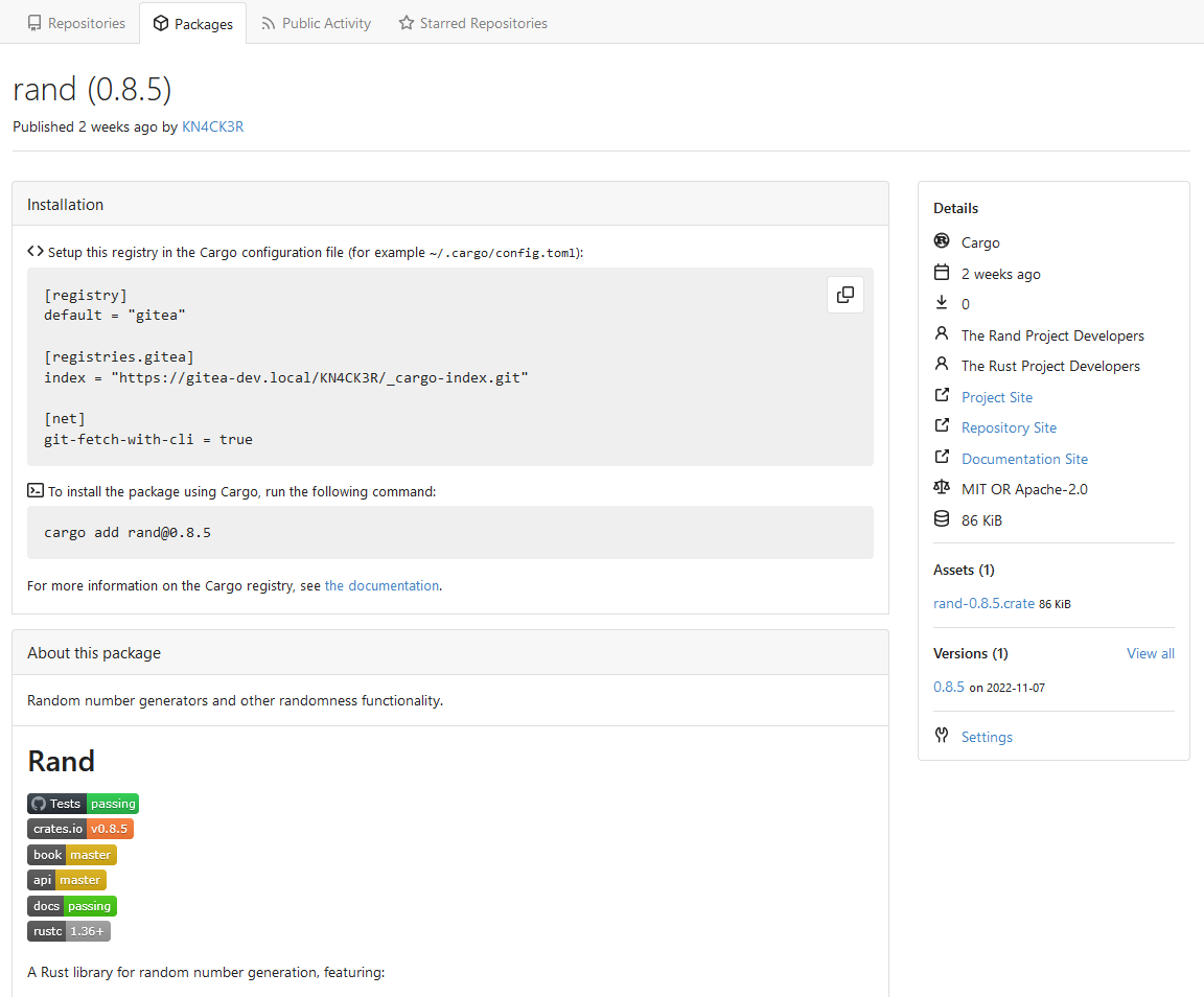
Add Cargo package registry ( #21888 )
...
This PR implements a [Cargo registry](https://doc.rust-lang.org/cargo/ )
to manage Rust packages. This package type was a little bit more
complicated because Cargo needs an additional Git repository to store
its package index.
Screenshots:


---------
Co-authored-by: Lunny Xiao <xiaolunwen@gmail.com>
2023-02-05 18:12:31 +08:00
Felipe Leopoldo Sologuren Gutiérrez
15c035775a
Add main landmark to templates and adjust titles ( #22670 )
...
* Add main aria landmark to templates
 * Adjust some titles to improve understanding of location in navigation

Contributed by @Forgejo
2023-02-01 22:56:10 +00:00
KN4CK3R
5882e179a9
Add user secrets ( #22191 )
...
Fixes #22183
Replaces #22187
This PR adds secrets for users. I refactored the files for organizations
and repos to use the same logic and templates. I splitted the secrets
from deploy keys again and reverted the fix from #22187 .
---------
Co-authored-by: Lunny Xiao <xiaolunwen@gmail.com>
2023-02-01 20:53:04 +08:00
Felipe Leopoldo Sologuren Gutiérrez
7fd5d38860
Improve checkbox accessibility a bit by adding the title attribute ( #22593 )
...
EDIT: The main change of this PR was resolved by #22599 . This
complements that PR for some cases without label and complicated layout
to be added.
NOTE: Contributed by @Forgejo.
2023-02-01 01:43:06 +00:00
Jason Song
4011821c94
Implement actions ( #21937 )
...
Close #13539 .
Co-authored by: @lunny @appleboy @fuxiaohei and others.
Related projects:
- https://gitea.com/gitea/actions-proto-def
- https://gitea.com/gitea/actions-proto-go
- https://gitea.com/gitea/act
- https://gitea.com/gitea/act_runner
### Summary
The target of this PR is to bring a basic implementation of "Actions",
an internal CI/CD system of Gitea. That means even though it has been
merged, the state of the feature is **EXPERIMENTAL**, and please note
that:
- It is disabled by default;
- It shouldn't be used in a production environment currently;
- It shouldn't be used in a public Gitea instance currently;
- Breaking changes may be made before it's stable.
**Please comment on #13539 if you have any different product design
ideas**, all decisions reached there will be adopted here. But in this
PR, we don't talk about **naming, feature-creep or alternatives**.
### ⚠️ Breaking
`gitea-actions` will become a reserved user name. If a user with the
name already exists in the database, it is recommended to rename it.
### Some important reviews
- What is `DEFAULT_ACTIONS_URL` in `app.ini` for?
- https://github.com/go-gitea/gitea/pull/21937#discussion_r1055954954
- Why the api for runners is not under the normal `/api/v1` prefix?
- https://github.com/go-gitea/gitea/pull/21937#discussion_r1061173592
- Why DBFS?
- https://github.com/go-gitea/gitea/pull/21937#discussion_r1061301178
- Why ignore events triggered by `gitea-actions` bot?
- https://github.com/go-gitea/gitea/pull/21937#discussion_r1063254103
- Why there's no permission control for actions?
- https://github.com/go-gitea/gitea/pull/21937#discussion_r1090229868
### What it looks like
<details>
#### Manage runners
<img width="1792" alt="image"
src="https://user-images.githubusercontent.com/9418365/205870657-c72f590e-2e08-4cd4-be7f-2e0abb299bbf.png ">
#### List runs
<img width="1792" alt="image"
src="https://user-images.githubusercontent.com/9418365/205872794-50fde990-2b45-48c1-a178-908e4ec5b627.png ">
#### View logs
<img width="1792" alt="image"
src="https://user-images.githubusercontent.com/9418365/205872501-9b7b9000-9542-4991-8f55-18ccdada77c3.png ">
</details>
### How to try it
<details>
#### 1. Start Gitea
Clone this branch and [install from
source](https://docs.gitea.io/en-us/install-from-source ).
Add additional configurations in `app.ini` to enable Actions:
```ini
[actions]
ENABLED = true
```
Start it.
If all is well, you'll see the management page of runners:
<img width="1792" alt="image"
src="https://user-images.githubusercontent.com/9418365/205877365-8e30a780-9b10-4154-b3e8-ee6c3cb35a59.png ">
#### 2. Start runner
Clone the [act_runner](https://gitea.com/gitea/act_runner ), and follow
the
[README](https://gitea.com/gitea/act_runner/src/branch/main/README.md )
to start it.
If all is well, you'll see a new runner has been added:
<img width="1792" alt="image"
src="https://user-images.githubusercontent.com/9418365/205878000-216f5937-e696-470d-b66c-8473987d91c3.png ">
#### 3. Enable actions for a repo
Create a new repo or open an existing one, check the `Actions` checkbox
in settings and submit.
<img width="1792" alt="image"
src="https://user-images.githubusercontent.com/9418365/205879705-53e09208-73c0-4b3e-a123-2dcf9aba4b9c.png ">
<img width="1792" alt="image"
src="https://user-images.githubusercontent.com/9418365/205879383-23f3d08f-1a85-41dd-a8b3-54e2ee6453e8.png ">
If all is well, you'll see a new tab "Actions":
<img width="1792" alt="image"
src="https://user-images.githubusercontent.com/9418365/205881648-a8072d8c-5803-4d76-b8a8-9b2fb49516c1.png ">
#### 4. Upload workflow files
Upload some workflow files to `.gitea/workflows/xxx.yaml`, you can
follow the [quickstart](https://docs.github.com/en/actions/quickstart )
of GitHub Actions. Yes, Gitea Actions is compatible with GitHub Actions
in most cases, you can use the same demo:
```yaml
name: GitHub Actions Demo
run-name: ${{ github.actor }} is testing out GitHub Actions 🚀
on: [push]
jobs:
Explore-GitHub-Actions:
runs-on: ubuntu-latest
steps:
- run: echo "🎉 The job was automatically triggered by a ${{ github.event_name }} event."
- run: echo "🐧 This job is now running on a ${{ runner.os }} server hosted by GitHub!"
- run: echo "🔎 The name of your branch is ${{ github.ref }} and your repository is ${{ github.repository }}."
- name: Check out repository code
uses: actions/checkout@v3
- run: echo "💡 The ${{ github.repository }} repository has been cloned to the runner."
- run: echo "🖥️ The workflow is now ready to test your code on the runner."
- name: List files in the repository
run: |
ls ${{ github.workspace }}
- run: echo "🍏 This job's status is ${{ job.status }}."
```
If all is well, you'll see a new run in `Actions` tab:
<img width="1792" alt="image"
src="https://user-images.githubusercontent.com/9418365/205884473-79a874bc-171b-4aaf-acd5-0241a45c3b53.png ">
#### 5. Check the logs of jobs
Click a run and you'll see the logs:
<img width="1792" alt="image"
src="https://user-images.githubusercontent.com/9418365/205884800-994b0374-67f7-48ff-be9a-4c53f3141547.png ">
#### 6. Go on
You can try more examples in [the
documents](https://docs.github.com/en/actions/using-workflows/workflow-syntax-for-github-actions )
of GitHub Actions, then you might find a lot of bugs.
Come on, PRs are welcome.
</details>
See also: [Feature Preview: Gitea
Actions](https://blog.gitea.io/2022/12/feature-preview-gitea-actions/ )
---------
Co-authored-by: a1012112796 <1012112796@qq.com>
Co-authored-by: Lunny Xiao <xiaolunwen@gmail.com>
Co-authored-by: delvh <dev.lh@web.de>
Co-authored-by: ChristopherHX <christopher.homberger@web.de>
Co-authored-by: John Olheiser <john.olheiser@gmail.com>
2023-01-31 09:45:19 +08:00
Brecht Van Lommel
be315c76fb
Fix poor alignment of organization description on organization home page ( #22656 )
...
Don't generate nested `<p>`, use `<div>` like description on the user
profile page.

Co-authored-by: Jason Song <i@wolfogre.com>
Co-authored-by: Lunny Xiao <xiaolunwen@gmail.com>
2023-01-30 16:16:12 +08:00
yp05327
4f8c0eba9a
set org visibility class to basic in header ( #22605 )
...
Fixes https://github.com/go-gitea/gitea/issues/22601

At people and team page, we have red private tag or orange limited tag,
but at repo page, it is gray (basic).
I think it is better to set them into same color (basic).
2023-01-26 12:44:34 -06:00
Lunny Xiao
6fe3c8b398
Support org/user level projects ( #22235 )
...
Fix #13405
<img width="1151" alt="image"
src="https://user-images.githubusercontent.com/81045/209442911-7baa3924-c389-47b6-b63b-a740803e640e.png ">
Co-authored-by: 6543 <6543@obermui.de>
2023-01-20 19:42:33 +08:00
Jason Song
659055138b
Secrets storage with SecretKey encrypted ( #22142 )
...
Fork of #14483 , but [gave up
MasterKey](https://github.com/go-gitea/gitea/pull/14483#issuecomment-1350728557 ),
and fixed some problems.
Close #12065 .
Needed by #13539 .
Featrues:
- Secrets for repo and org, not user yet.
- Use SecretKey to encrypte/encrypt secrets.
- Trim spaces of secret value.
- Add a new locale ini block, to make it easy to support secrets for
user.
Snapshots:
Repo level secrets:

Rrg level secrets

Co-authored-by: Lauris BH <lauris@nix.lv>
Co-authored-by: Lunny Xiao <xiaolunwen@gmail.com>
Co-authored-by: wxiaoguang <wxiaoguang@gmail.com>
Co-authored-by: delvh <dev.lh@web.de>
Co-authored-by: KN4CK3R <admin@oldschoolhack.me>
2022-12-20 17:07:13 +08:00
Lunny Xiao
68704532c2
Rename almost all Ctx functions ( #22071 )
2022-12-10 10:46:31 +08:00