wxiaoguang
012b804a9a
Clarify "text-align" CSS helpers, fix clone button padding ( #25763 ) ( #25764 )
...
Backport  #25763

Co-authored-by: silverwind <me@silverwind.io>
Co-authored-by: Giteabot <teabot@gitea.io>
2023-07-10 00:19:24 +02:00
Giteabot
32eaba1b40
Hide add file button for pull mirrors ( #25748 ) ( #25751 )
...
Backport #25748 by @hiifong
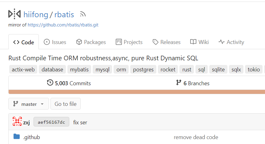
I think hiding the add file button for mirror repositories that can keep
the ui clean.
Before:

After:
Co-authored-by: hiifong <i@hiif.ong>
2023-07-07 14:12:59 +00:00
Denys Konovalov
917ca5ded9
Several fixes for mobile UI ( #25634 ) ( #25689 )
...
Backport #25634
Resolves https://github.com/go-gitea/gitea/issues/25622
<details>
<summary>Screenshots</summary>


</details>
---------
Co-authored-by: wxiaoguang <wxiaoguang@gmail.com>
Co-authored-by: silverwind <me@silverwind.io>
Co-authored-by: Giteabot <teabot@gitea.io>
2023-07-07 00:34:00 +02:00
Giteabot
e595dfeec7
Allow/fix review (approve/reject) of empty PRs ( #25690 ) ( #25732 )
...
Backport #25690 by @sebastian-sauer
gitea allows to create empty PRs.
Currently when you need approvals for a merge, you have to manually add
/files to the url to get to the files tab to approve / reject the PR.
This PR allows to open the files tab via the normal tab / link and then
fixes the layout of the files tab.
**Screenshots:**
Before:

After:

Co-authored-by: sebastian-sauer <sauer.sebastian@gmail.com>
Co-authored-by: silverwind <me@silverwind.io>
2023-07-06 19:34:41 +00:00
Giteabot
68e0c802f7
Show correct naming for 1 comment ( #25704 ) ( #25712 )
...
Backport #25704 by @earl-warren

- Resolves https://codeberg.org/forgejo/forgejo/issues/948

Co-authored-by: Earl Warren <109468362+earl-warren@users.noreply.github.com>
Co-authored-by: Gusted <postmaster@gusted.xyz>
2023-07-06 16:04:13 +00:00
Giteabot
04eea29ecb
Fix tags header and pretty format numbers ( #25624 ) ( #25694 )
...
Backport #25624 by @lunny
This casused by #23465
Before
release disabled
<img width="1320" alt="图片"
src="https://github.com/go-gitea/gitea/assets/81045/190a1c81-daa5-41bc-91ac-c9a0bf629b5f ">
release enabled
<img width="1320" alt="图片"
src="https://github.com/go-gitea/gitea/assets/81045/a0372c31-727c-4ee0-a6b9-30e502498d90 ">
After
release disabled
<img width="1304" alt="图片"
src="https://github.com/go-gitea/gitea/assets/81045/a747ea80-a3d9-4792-8f6d-e8955da78b9e ">
release enabled
<img width="1290" alt="图片"
src="https://github.com/go-gitea/gitea/assets/81045/7c0bc43a-9149-4148-859d-35839aeb60ca ">
Co-authored-by: Lunny Xiao <xiaolunwen@gmail.com>
2023-07-05 07:08:16 +00:00
silverwind
491f36d32a
Actions list enhancements ( #25601 ) ( #25678 )
...
Backport https://github.com/go-gitea/gitea/pull/25601 to 1.20.
Various small enhancements to the actions list. Before and after:
<img width="1264" alt="Screenshot 2023-06-30 at 00 11 40"
src="https://github.com/go-gitea/gitea/assets/115237/bb4162ee-cdcf-4a73-b05e-f9521562edbb ">
<img width="1264" alt="Screenshot 2023-06-30 at 00 09 51"
src="https://github.com/go-gitea/gitea/assets/115237/52a70ea9-4bb3-406e-904b-0fdaafde9582 ">
Co-authored-by: Giteabot <teabot@gitea.io>
2023-07-04 13:00:34 +00:00
Giteabot
1ddfe03131
Use AfterCommitId to get commit for Viewed functionality ( #25529 ) ( #25612 )
...
Backport #25529 by @sebastian-sauer

the PullHeadCommitID is not always available when the PR is merged.

Not sure if this is the best solution but in my simple tests it looks
like this fixes the problem - happy to get any feedback.

hopefully fixes https://github.com/go-gitea/gitea/issues/24813

Co-authored-by: sebastian-sauer <sauer.sebastian@gmail.com>
2023-07-01 07:56:56 +08:00
Giteabot
0b6f7fb607
read-only checkboxes don't appear and don't entirely act the way one might expect ( #25573 ) ( #25602 )
...
Backport #25573 by @saegl5
This pull request fades read-only checkboxes and checkmark, and it makes
the checkboxes act more read-only/disabled by not changing the
border-color when clicked.
Examples using light mode:
| Before | After |
| - | - |
| 
| 
|
| 
| 
|
| | read-only checkboxes and checkmark are faded<br>and the checkboxes
act more read-only/disabled |
Fixes/Closes/Resolves #25076
Co-authored-by: Ed Silkworth <ed.silkworth@icloud.com>
Co-authored-by: silverwind <me@silverwind.io>
Co-authored-by: wxiaoguang <wxiaoguang@gmail.com>
2023-06-29 22:53:43 +00:00
Giteabot
51b6a78791
Fix milestones deletion ( #25583 ) ( #25584 )
...
Backport #25583 by @HesterG

Close #25557
Fix regression from #25315

`data-id` is still needed for deleting milestone.

Co-authored-by: HesterG <hestergong@gmail.com>
2023-06-29 08:52:05 +00:00
Giteabot
9bbb4d8d6d
Improve loadprojects for issue list ( #25468 ) ( #25493 )
2023-06-26 02:06:58 +00:00
Giteabot
85bad22ff8
Fine tune "dropdown button" icon ( #25442 ) ( #25499 )
...
Backport #25442 by @wxiaoguang

----

Co-authored-by: wxiaoguang <wxiaoguang@gmail.com>
2023-06-25 14:35:26 +08:00
Giteabot
51789ba12d
Improve wiki sidebar and TOC ( #25460 ) ( #25477 )
...
Backport #25460 by @wxiaoguang
Close #20976
Close #20975
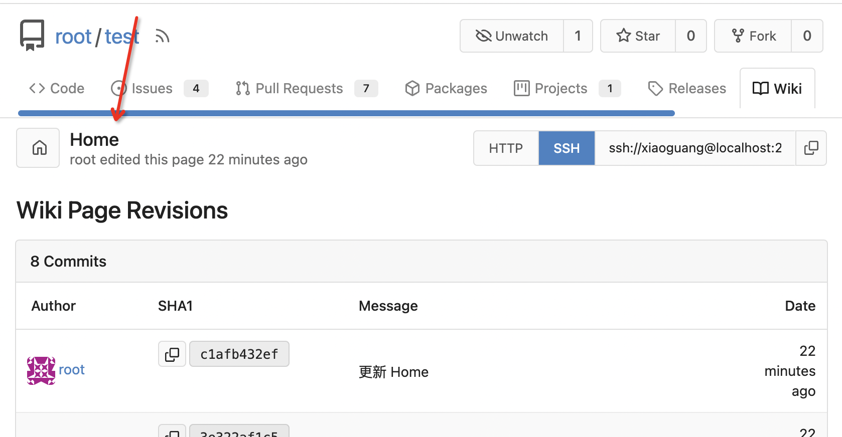
1. Fix the bug: the TOC in footer was incorrectly rendered as main
content's TOC
2. Fix the layout: on mobile, the TOC is put above the main content,
while the sidebar is put below the main content
3. Auto collapse the TOC on mobile
ps: many styles of "wiki.css" are moved from old css files, so leave
nits to following PRs.
### for desktop

### for mobile

### other changed pages
<details>

</details>
Co-authored-by: wxiaoguang <wxiaoguang@gmail.com>
2023-06-24 10:16:15 +08:00
Giteabot
2e64449de7
Make "dismiss" content shown correctly ( #25461 ) ( #25465 )
...
Backport #25461 by @wxiaoguang
Close #25127

Co-authored-by: wxiaoguang <wxiaoguang@gmail.com>
2023-06-23 11:04:15 +00:00
Giteabot
056829749e
Diff page enhancements ( #25398 ) ( #25437 )
...
Backport #25398 by @silverwind
Two small tweaks:
1. Vertically center arrow here when editing a PR:
<img width="405" alt="Screenshot 2023-06-20 at 19 48 49"
src="https://github.com/go-gitea/gitea/assets/115237/1d63764d-9fd9-467e-8a8e-9258c06475eb ">
2. Use 2-row layout on diff viewed status and show it again on mobile:
<img width="142" alt="Screenshot 2023-06-20 at 19 51 21"
src="https://github.com/go-gitea/gitea/assets/115237/3046e782-163c-4f87-910c-a22066de8f1b ">
Mobile view:
<img width="370" alt="Screenshot 2023-06-20 at 19 44 40"
src="https://github.com/go-gitea/gitea/assets/115237/9cf56347-7323-4d05-99a5-17ad215ee44d ">
Co-authored-by: silverwind <me@silverwind.io>
2023-06-22 14:33:13 +02:00
Giteabot
ea00ed320d
Various UI fixes ( #25264 ) ( #25431 )
...
Backport #25264 by @silverwind
Numerous small UI fixes:
- Fix double border in collaborator list
- Fix system notice table background
- Mute links in repo and org lists
- Downsize projects edit buttons
- Improve milestones and project list rendering
- Condense milestone list entry to a single line of "metas"
- Mute ".." button in repo files list
<img width="899" alt="Screenshot 2023-06-14 at 21 19 23"
src="https://github.com/go-gitea/gitea/assets/115237/40d70006-5f76-49ad-b43c-4343ec3311e1 ">
<img width="905" alt="Screenshot 2023-06-14 at 21 18 29"
src="https://github.com/go-gitea/gitea/assets/115237/46ef39ea-ab26-452d-89b0-a55d0cfacfdb ">
<img width="270" alt="Screenshot 2023-06-14 at 21 14 09"
src="https://github.com/go-gitea/gitea/assets/115237/aa16e833-a03b-4231-bc7c-159a6a6bee19 ">
<img width="409" alt="Screenshot 2023-06-14 at 21 12 13"
src="https://github.com/go-gitea/gitea/assets/115237/b5242d41-f87a-4837-b0cf-9cc4c1f43daf ">
<img width="286" alt="Screenshot 2023-06-14 at 21 10 03"
src="https://github.com/go-gitea/gitea/assets/115237/d0c36e47-651b-4d34-ad95-3d59474a7c3e ">
<img width="928" alt="Screenshot 2023-06-14 at 21 05 24"
src="https://github.com/go-gitea/gitea/assets/115237/fc3b713e-d252-40f5-b6ba-6e5a741ab500 ">
<img width="217" alt="Screenshot 2023-06-14 at 21 02 01"
src="https://github.com/go-gitea/gitea/assets/115237/c4c33376-18d6-4820-aff5-f508f6d351a0 ">
<img width="79" alt="Screenshot 2023-06-14 at 20 42 43"
src="https://github.com/go-gitea/gitea/assets/115237/034b5950-c0bf-473b-a2f7-0c27a0259f29 ">
<img width="607" alt="Screenshot 2023-06-14 at 21 00 42"
src="https://github.com/go-gitea/gitea/assets/115237/fba2d3fd-bd3e-4daf-8b2f-530a1c99c8bc ">
Co-authored-by: silverwind <me@silverwind.io>
2023-06-22 10:19:38 +00:00
sebastian-sauer
30a783879f
Show outdated comments in files changed tab ( #24936 ) ( #25428 )
...
Backport #24936
If enabled show a clickable label in the comment. A click on the label
opens the Conversation tab with the comment focussed - there you're able
to view the old diff (or original diff the comment was created on).
**Screenshots**


When resolved and outdated:

Option to enable/disable this (stored in user settings - default is
disabled):


fixes #24913
Co-authored-by: silverwind <me@silverwind.io>
2023-06-22 08:34:42 +00:00
Giteabot
cda69a0363
Fix dropdown icon layout on diff page ( #25397 ) ( #25403 )
...
Backport #25397 by @wxiaoguang
Address
https://github.com/go-gitea/gitea/pull/25163#issuecomment-1599207916
Remove the unused "icon-button".
And fix the layout:
Without the dropdown icon:
```
{{svg "gitea-whitespace"}}
```

With the dropdown icon:
```
{{svg "gitea-whitespace" 16 "gt-mr-3"}}
{{svg "octicon-triangle-down" 14 "dropdown icon"}}
```

Co-authored-by: wxiaoguang <wxiaoguang@gmail.com>
2023-06-21 10:55:11 +08:00
Giteabot
e9105ac281
Fix label list divider ( #25312 ) ( #25372 )
...
Backport #25312 by @wxiaoguang
We only needs 2 lines to hide the dividers.
```
$dropdownLabelFilter.dropdown('setting', {'hideDividers': 'empty'});
$dropdownLabelFilter.dropdown('refreshItems');
```
Other code blocks are refactored by the way.


Co-authored-by: wxiaoguang <wxiaoguang@gmail.com>
2023-06-19 18:14:31 +00:00
Giteabot
e6e1cfd8e4
fix issue filters on mobile view ( #25368 ) ( #25371 )
...
Backport #25368 by @denyskon
Fix #24846 applying the solution proposed by @silverwind
<details>
<summary>Screenshots</summary>


</details>
Replaces #25335
Co-authored-by: Denys Konovalov <kontakt@denyskon.de>
2023-06-19 17:43:22 +00:00
Giteabot
b673edbeaf
Fix UI on mobile view ( #25315 ) ( #25340 )
...
Backport #25315 by @denyskon
Various fixes to pages or elements which were looking ugly on mobile.
<details>
<summary>Screenshots</summary>


</details>
Co-authored by: @silverwind
Co-authored-by: Denys Konovalov <kontakt@denyskon.de>
Co-authored-by: silverwind <me@silverwind.io>
2023-06-18 13:02:41 +00:00
Giteabot
4e79c76ed0
When viewing a file, hide the add button ( #25320 ) ( #25339 )
...
Backport #25320 by @hiifong
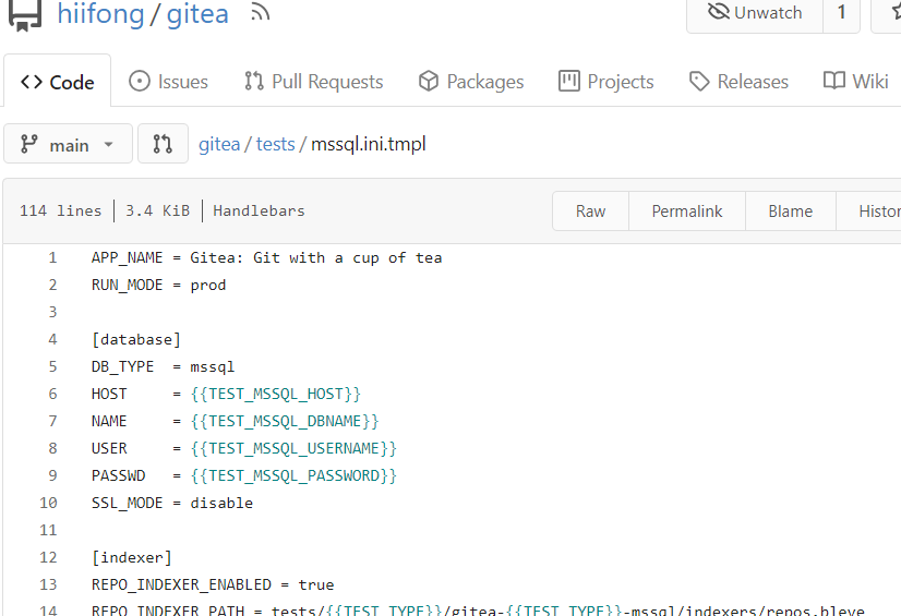
Fix #25281
When viewing a file, hide the add button

Co-authored-by: hiifong <i@hiif.ong>
2023-06-18 10:24:54 +00:00
Giteabot
e5422db5c7
Show if File is Executable ( #25287 ) ( #25300 )
...
Backport #25287 by @JakobDev
This simply shows if a File has the executable Permission

Co-authored-by: JakobDev <jakobdev@gmx.de>
Co-authored-by: silverwind <me@silverwind.io>
2023-06-16 09:29:26 +00:00
Giteabot
783f7ccb2c
Fix some UI alignments ( #25277 ) ( #25290 )
...
Backport #25277 by @wxiaoguang
Fixes: https://github.com/go-gitea/gitea/issues/25282
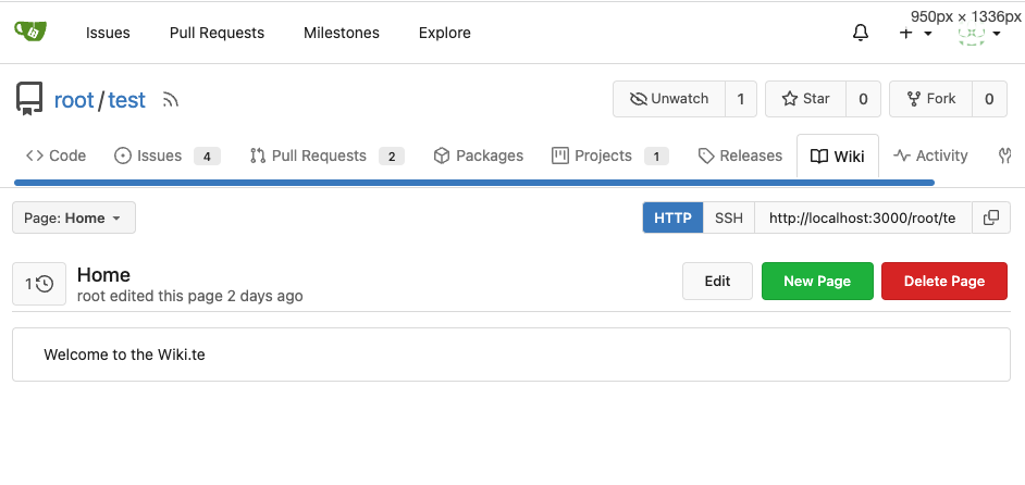
Fix the problems:
1. The `repo-button-row` had various patches before, this PR makes it
consistent
2. The "Add File" has wrong CSS class "icon", remove it
3. The "Add File" padding was overridden by "!important", fix it by
`.repo-button-row .button.dropdown` with comment
4. The selector `.ui.segments ~ .ui.top.attached.header` is incorrect,
it should use `+`
The `repo-button-row` is only used on 3 pages:



Co-authored-by: wxiaoguang <wxiaoguang@gmail.com>
2023-06-16 00:32:59 +00:00
Giteabot
5191ab6445
Use flex to align SVG and text ( #25163 ) ( #25260 )
...
Backport #25163 by @wxiaoguang
The code can be as simple as:
```html
<div class="flex-text-block">{{svg "octicon-alert"}} {{svg "octicon-x"}} text (block)</div>
<div><div class="flex-text-inline">{{svg "octicon-alert"}} {{svg "octicon-x"}} text</div> (inline)</div>
<div><button class="ui red button">{{svg "octicon-alert" 24}} {{svg "octicon-x" 24}} text</button></div>
```

Co-authored-by: wxiaoguang <wxiaoguang@gmail.com>
2023-06-14 13:21:48 -04:00
silverwind
224ee0d4e5
Fix strange UI behavior of cancelling dismiss review modal ( #25172 )
...
Backport clean cherry-picks of
https://github.com/go-gitea/gitea/pull/25133 and
https://github.com/go-gitea/gitea/pull/25162 to 1.20.
2023-06-11 02:54:30 +00:00
silverwind
ee26d1c578
Button and color enhancements ( #24989 ) ( #25176 )
...
Backport #24989 . Clean cherry-pick aside from one small conflict with
divider.
- Various corrections to button styles, especially secondary
- Remove focus highlight, it's annoying when it stays on button after
press
- Clearly define ghost and link buttons with demos in devtest
- Remove black, grey and tertiary buttons, they should not be used
- Make `arc-green` slightly darker
<img width="1226" alt="image"
src="https://github.com/go-gitea/gitea/assets/115237/8d89786a-01ab-40f8-ae5a-e17f40e35084 ">
<img width="1249" alt="image"
src="https://github.com/go-gitea/gitea/assets/115237/83651e6d-3c27-46ff-b8bd-ff344d70e949 ">
2023-06-11 02:13:08 +00:00
Giteabot
18093d4c9a
Fix mobile navbar and misc cleanups ( #25134 ) ( #25169 )
...
Backport #25134 by @silverwind
- Fix and improve mobile navbar layout
- Apply all cleanups suggested in
https://github.com/go-gitea/gitea/pull/25111
- Make media query breakpoints match Fomantic's exactly
- Clean up whitespace in class on navbar items
Mobile navbar before and after:
<img width="745" alt="Screenshot 2023-06-08 at 08 40 56"
src="https://github.com/go-gitea/gitea/assets/115237/ca84b239-b10f-41db-8c06-dcf2b6dd9d28 ">
<img width="739" alt="Screenshot 2023-06-08 at 08 41 23"
src="https://github.com/go-gitea/gitea/assets/115237/09133c54-eb7e-4110-858c-ead23c3b7521 ">
2023-06-11 09:50:39 +08:00
HesterG
58536093b3
Add details summary for vertical menus in settings to allow toggling ( #25098 )
...
Close #25051
[referenced
answer](https://stackoverflow.com/questions/10813581/can-i-replace-the-expand-icon-of-the-details-element/69722686#69722686 )
for marker overwrite. One limitation is that fomantic does not have
hover and active effects for the vertical submenu
([reference](https://fomantic-ui.com/collections/menu.html#sub-menu )).
And we might need to overwrite some styles if hover and active effects
are needed.
Update:
Used `data:image/svg` instead of `marker` content. And adjusted styles
for hover effect.
Take admin settings as an example:
https://github.com/go-gitea/gitea/assets/17645053/63f69823-ef43-47d5-a518-544b5ea35ba6
---------
Co-authored-by: silverwind <me@silverwind.io>
2023-06-07 10:49:48 +08:00
Yevhen Pavlov
8d7893e817
Don't display select all issues checkbox when no issues are available ( #25086 )
...
Before:
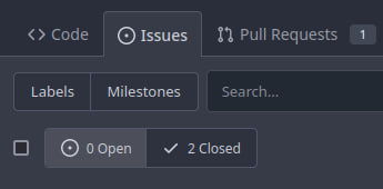
After:

2023-06-06 08:19:24 +08:00
6543
395a6fabf3
fix "Remove stars when repo goes private #19904 " ( #25084 )
...
https://github.com/go-gitea/gitea/pull/19904#discussion_r1218111682
2023-06-05 15:23:09 +00:00
Wim
62ac3251fa
Remove stars when repo goes private ( #19904 )
...
Fixes #18600
2023-06-05 13:25:43 +00:00
JakobDev
7d192cb674
Add Progressbar to Milestone Page ( #25050 )
...
This is adds the progress bar, which is already on the Milestone List,
also to the Page of a Single Milestone.

---------
Co-authored-by: silverwind <me@silverwind.io>
2023-06-05 14:25:46 +08:00
Yarden Shoham
4486dd39e7
Remove cancel button from branch protection form ( #25063 )
...
It caused bugs. To cancel, just navigate away.
- Follows #21381 and #21872
- Resolves #25038
## Before

## After

Signed-off-by: Yarden Shoham <git@yardenshoham.com>
2023-06-03 20:06:09 +08:00
Kyle D
72eedfb915
Show file tree by default ( #25052 )
...
Feel free to close this if there isn't interest.
The tree view looks amazing, and all of our users are really enjoying it
(major kudos to developers!), but only IF I tell them it exists!
Essentially, the file tree view as it is effectively undiscoverable.
This PR changes the default state for the tree view to open, which
should significantly help with discoverability.
An alternative could be to reserve more horizontal space, as a typical
accordion panel would look (eg. VS Code), eg.

2023-06-02 23:39:01 +08:00
silverwind
c5ede35124
Add button on diff header to copy file name, misc diff header tweaks ( #24986 )
...
1. Add this button:
<img width="232" alt="Screenshot 2023-05-29 at 15 21 47"
src="https://github.com/go-gitea/gitea/assets/115237/5eaf6bd1-83db-4ffc-9503-eda0c59807d2 ">
<img width="297" alt="Screenshot 2023-05-29 at 15 20 22"
src="https://github.com/go-gitea/gitea/assets/115237/708a344f-f6d7-4229-bfda-76e1571b42c8 ">
2. Correct `button-link` styles to not have a background hover effect.
3. Tweak `.ui.container` padding to be the same for fluid and non-fluid.
4. Misc enhancements to diff header:
Before:
<img width="984" alt="Screenshot 2023-05-29 at 15 38 53"
src="https://github.com/go-gitea/gitea/assets/115237/c7926f6a-bd0a-4b05-97ad-c91fc25c62d5 ">
After:
<img width="987" alt="Screenshot 2023-05-29 at 15 43 10"
src="https://github.com/go-gitea/gitea/assets/115237/0149f545-45f8-42cf-b443-e1c76bd5cdeb ">
2023-06-01 10:47:28 +00:00
delvh
bf27fc3596
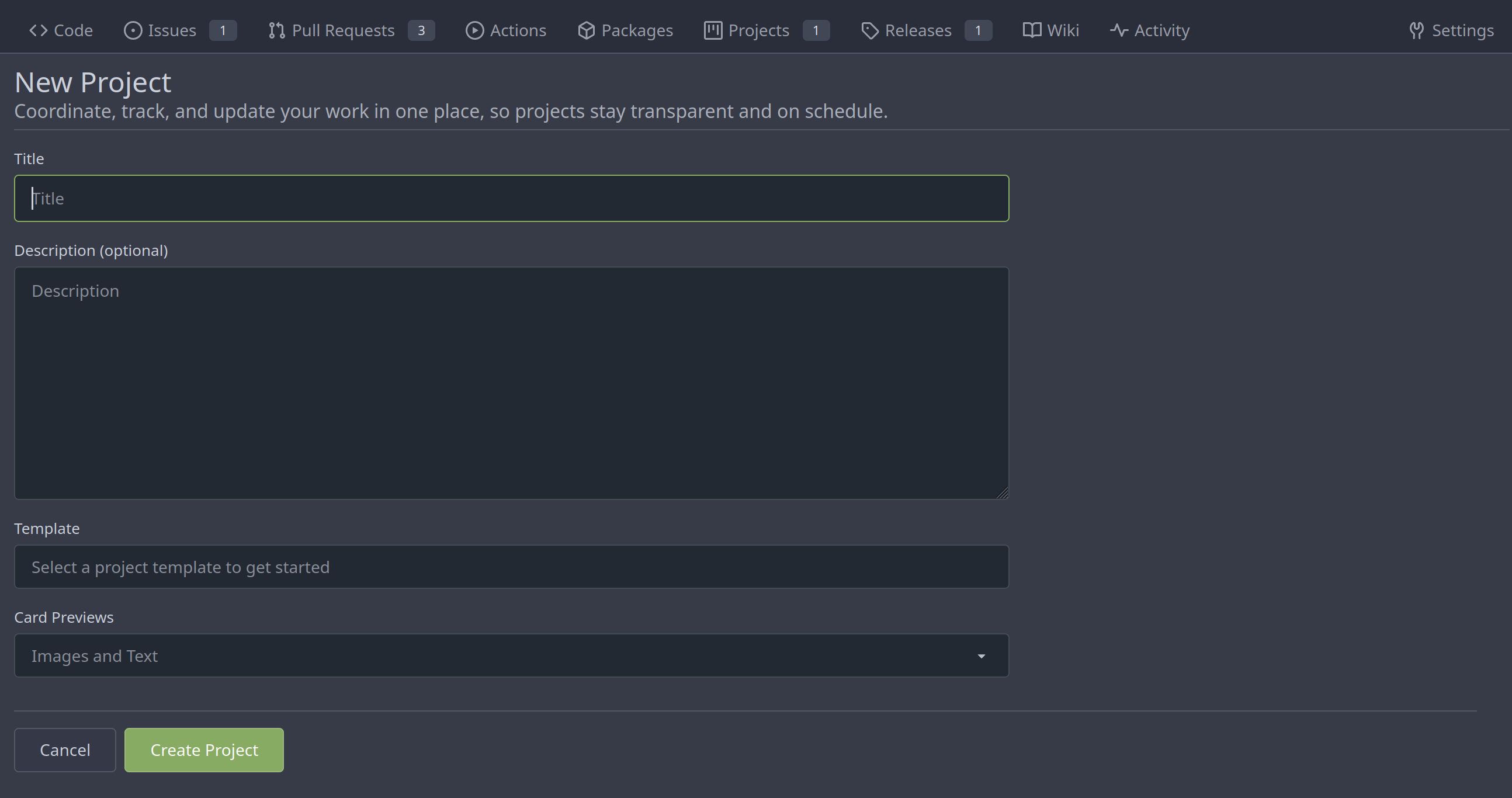
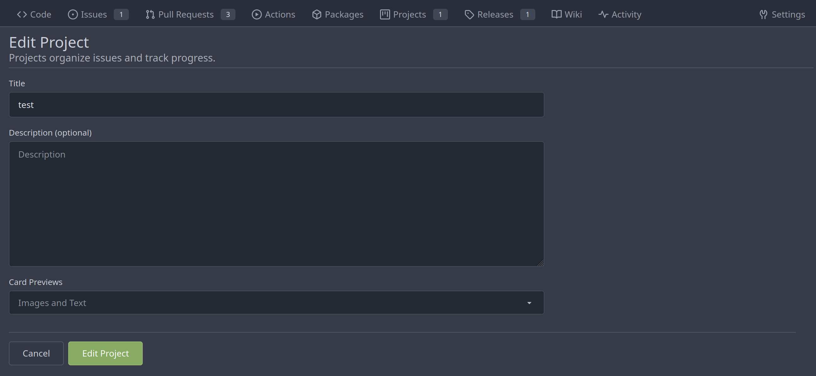
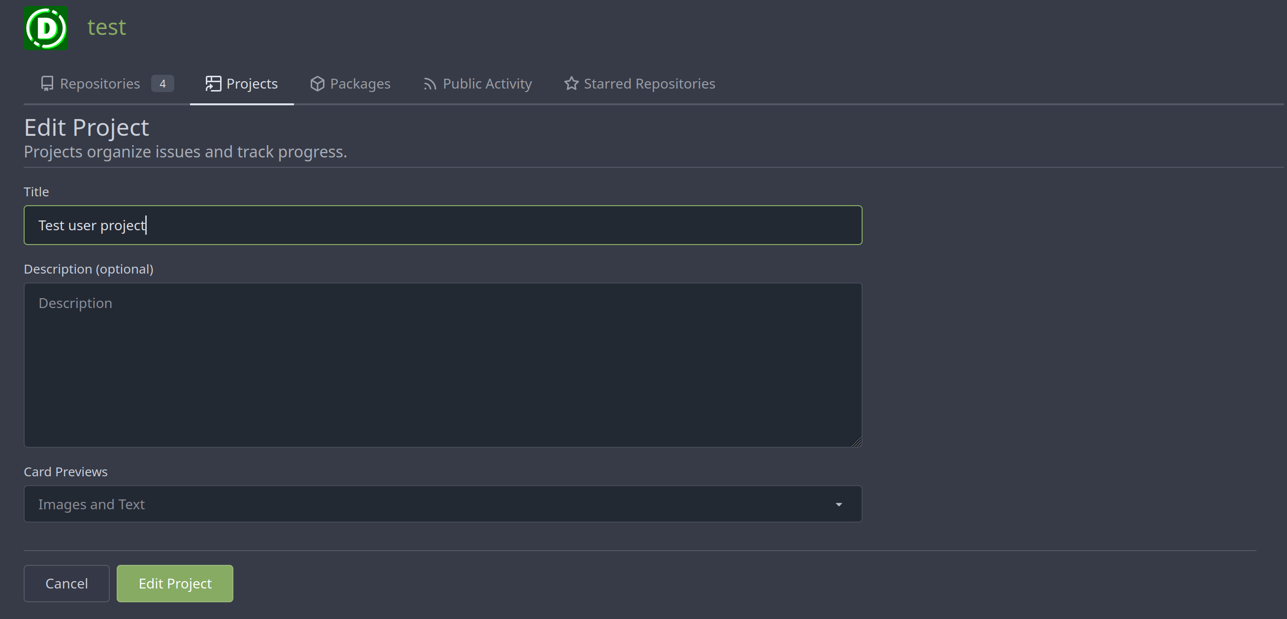
Merge new project templates into one ( #24985 )
...
Additionally simplify the `new project` template slightly.
Review hint: Disable whitespace changes.
<details><summary>Before</summary>
## New repo project

## Edit repo project

## New user/org project

## Edit user/org project

</details>
<details><summary>After</summary>
## New repo project
## Edit repo project
## New user/org project

## Edit user/org project
</details>
---------
Co-authored-by: Giteabot <teabot@gitea.io>
2023-05-31 08:50:18 +02:00
Denys Konovalov
0c79a655d4
various style fixes ( #25008 )
...
- fixing various style issues (border color/radius, margin)
- added indent at some radio input blocks
---
### Before:


### After:


---------
Co-authored-by: silverwind <me@silverwind.io>
2023-05-30 22:28:25 +00:00
HesterG
1ea5c8b0ff
Add show timestamp/seconds and fullscreen options to action page ( #24876 )
...
Part of #24728
- The timestamp shows local time and is parsed by `date.toLocaleString`;
- "show seconds" and "show timestamps" are mutually exclusive, and they
can be both hidden.
https://github.com/go-gitea/gitea/assets/17645053/89531e54-37b7-4400-a6a0-bb3cc69eb6f5
Update for timestamp format:
<img width="306" alt="Screen Shot 2023-05-25 at 09 07 47"
src="https://github.com/go-gitea/gitea/assets/17645053/2d99768d-d39c-4c9e-81a2-7bc7470399dd ">
---------
Co-authored-by: silverwind <me@silverwind.io>
Co-authored-by: wxiaoguang <wxiaoguang@gmail.com>
2023-05-30 20:38:55 +00:00
JakobDev
1b115296d3
Followup to pinned Issues ( #24945 )
...
This addressees some things from #24406 that came up after the PR was
merged. Mostly from @delvh.

---------

Co-authored-by: silverwind <me@silverwind.io>
Co-authored-by: delvh <dev.lh@web.de>
2023-05-30 15:26:51 +00:00
wxiaoguang
ee99cf6313
Refactor diffFileInfo / DiffTreeStore ( #24998 )
...
Follow #21012 , #22399
Replace #24983 , fix #24938
Help #24956
Now, the `window.config.pageData.diffFileInfo` itself is a reactive
store, so it's quite easy to sync values/states by it, no need to do
"doLoadMoreFiles" or "callback".
Screenshot: these two buttons both work. After complete loading, the UI
is also right.
<details>


</details>
2023-05-30 18:53:15 +08:00
Yevhen Pavlov
a36c620583
Display file mode for new file and file mode changes ( #24966 )
...
This MR introduces the addition of file mode display support for both
new file creation and file mode changes, following a similar approach as
GitLab.
GitLab:

Gitea:
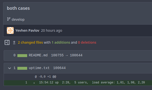
Replaces: https://github.com/go-gitea/gitea/pull/23159
Closes: https://github.com/go-gitea/gitea/issues/23021
---------
Co-authored-by: silverwind <me@silverwind.io>
Co-authored-by: delvh <dev.lh@web.de>
Co-authored-by: Giteabot <teabot@gitea.io>
2023-05-29 19:56:08 +02:00
HesterG
085a8857f9
Fix repo level project - edit column ( #24982 )
...
Right now edit column of repo level project is not working, because edit
button does not have the `edit-column-button` class, which is used in
the [js
selector](28077e66c0/web_src/js/features/repo-projects.js (L106)https://github.com/go-gitea/gitea/assets/17645053/e1fba190-477d-4814-87f2-0fd979376840
Co-authored-by: Giteabot <teabot@gitea.io>
2023-05-29 16:32:15 +00:00
silverwind
73b57c2992
Improve dropdown menus, remove inline styles ( #24954 )
...
Before:
<img width="190" alt="Screenshot 2023-05-27 at 10 46 43"
src="https://github.com/go-gitea/gitea/assets/115237/b9331fcd-db1d-476e-87f0-f79bae48b1a5 ">
After:
<img width="154" alt="Screenshot 2023-05-28 at 19 29 03"
src="https://github.com/go-gitea/gitea/assets/115237/8b7f99a2-01a8-4665-9342-a6201b51d30f ">
---------
Co-authored-by: Giteabot <teabot@gitea.io>
2023-05-29 14:10:06 +00:00
silverwind
79a4c80f8d
Rework button coloring, add focus and active colors ( #24507 )
...
We were missing overrides for `:focus` and `:active` styles which I've
added here along with two new color variants `dark-1` and `dark-2` for
them. Fomantic UI has 4 different colors but I think 3 are sufficient. I
also changed it on arc-green so button goes darker when pressed.
<img width="129" alt="Screenshot 2023-05-04 at 01 21 43"
src="https://user-images.githubusercontent.com/115237/236072060-7389276a-275b-4d3e-aa52-20b37c6e6d92.png ">
<img width="130" alt="Screenshot 2023-05-04 at 01 17 59"
src="https://user-images.githubusercontent.com/115237/236071818-0e46414a-33db-4bb2-a3bd-35b514a8a2d0.png ">
<img width="129" alt="Screenshot 2023-05-04 at 01 18 07"
src="https://user-images.githubusercontent.com/115237/236071819-562b1e38-541f-432b-b3b6-48e6d7594d00.png ">
<img width="131" alt="Screenshot 2023-05-04 at 01 18 13"
src="https://user-images.githubusercontent.com/115237/236071820-89b7dba9-ce6c-48e5-a075-9053063e6ad3.png ">
<img width="133" alt="Screenshot 2023-05-04 at 01 18 30"
src="https://user-images.githubusercontent.com/115237/236071823-b6fe2df4-b3f0-4dc8-97a8-f90ba6d19bec.png ">
<img width="133" alt="Screenshot 2023-05-04 at 01 18 40"
src="https://user-images.githubusercontent.com/115237/236071824-b02ce61a-2367-4c29-8a25-45f231f5e5ee.png ">
One misc change includes some fixes to editor and slightly darker
selection.
<img width="1245" alt="Screenshot 2023-05-28 at 19 16 19"
src="https://github.com/go-gitea/gitea/assets/115237/1ea4a4b6-26ba-45af-9cbc-5b8c476c2338 ">
2023-05-29 12:45:22 +00:00
silverwind
e4e98979ff
Add PDF rendering via PDFObject ( #24086 )
...
Use [PDFObject](https://pdfobject.com/ ) to embed PDFs, replacing our
outdated PDF.js copy we vendor (the last non-webpack vendoring).
[Commit
1](673e0263da9336f5769dhttps://github.com/go-gitea/gitea/assets/115237/169ce50c-bd1d-4bb0-86e5-1710bd0400a9 ">
<img width="1257" alt="Screenshot 2023-05-27 at 10 12 50"
src="https://github.com/go-gitea/gitea/assets/115237/318f7ee9-fb11-4093-83e7-17475aa70629 ">
Fallback for unsupporting browsers (most mobile ones, except Firefox
Mobile):
<img width="358" alt="Screenshot 2023-05-27 at 09 43 34"
src="https://github.com/go-gitea/gitea/assets/115237/8c12d7ba-57d6-4228-89a0-5fef9fad0cbb ">
---------
Co-authored-by: Giteabot <teabot@gitea.io>
2023-05-29 12:10:00 +00:00
Panagiotis "Ivory" Vasilopoulos
35ce7ca25b
Hide 'Mirror Settings' when unneeded, improve hints ( #24433 )
...
Co-authored-by: silverwind <me@silverwind.io>
Co-authored-by: Giteabot <teabot@gitea.io>
2023-05-29 11:32:52 +00:00
silverwind
a70d853d06
Consolidate the two review boxes into one ( #24738 )
...
View diff:
https://github.com/go-gitea/gitea/pull/24738/files?diff=unified&w=1
Improve layout and functionality in review area:
<img width="439" alt="Screenshot 2023-05-15 at 20 10 01"
src="https://github.com/go-gitea/gitea/assets/115237/be10452b-5829-4927-8801-7b26a57b3dbd ">
Remove the "Reviewers" timeline box that appears before the merge box.
it's a duplicate of the top-right review area and all functionality of
it has been moved to the other box:
<img width="868" alt="Screenshot 2023-05-15 at 19 39 31"
src="https://github.com/go-gitea/gitea/assets/115237/35489445-e54b-40d3-b3cf-38d029478f96 ">
Increase timeline item vertical padding from 12px to 16px:
<img width="449" alt="Screenshot 2023-05-15 at 19 43 50"
src="https://github.com/go-gitea/gitea/assets/115237/919c4f9d-a485-4f51-b08c-2c0fc714a413 ">
---------
Co-authored-by: Giteabot <teabot@gitea.io>
2023-05-29 12:44:03 +02:00
silverwind
595e8abd68
Improve and fix bugs surrounding reactions ( #24760 )
...
- Slightly decrease size of reaction buttons
- Remove tooltip inside menu, it's obvious by the picture alone
- Fix top menu triangle
- Use `display: grid` to align icons in menu
- Use regular tooltip for reaction users
- Fix bug that deleted the reaction bar on clicking already reacted
reaction in dropdown
<img width="490" alt="Screenshot 2023-05-17 at 00 03 42"
src="https://github.com/go-gitea/gitea/assets/115237/61588b37-facb-4829-b75b-e1cb5dda8ca4 ">
<img width="67" alt="Screenshot 2023-05-17 at 00 11 14"
src="https://github.com/go-gitea/gitea/assets/115237/29605589-3b5f-40c6-8ad4-09923094bb8e ">
<img width="211" alt="Screenshot 2023-05-17 at 00 29 30"
src="https://github.com/go-gitea/gitea/assets/115237/7d2725da-6a3d-4e42-a351-53647f79f762 ">
<img width="210" alt="Screenshot 2023-05-17 at 00 29 54"
src="https://github.com/go-gitea/gitea/assets/115237/b50f8364-033c-4445-ba25-61a814bb2d92 ">
<img width="892" alt="Screenshot 2023-05-17 at 00 12 20"
src="https://github.com/go-gitea/gitea/assets/115237/30a46424-406a-46e5-b4de-47172eb8679d ">
---------
Co-authored-by: wxiaoguang <wxiaoguang@gmail.com>
Co-authored-by: Giteabot <teabot@gitea.io>
2023-05-28 01:34:18 +00:00
JakobDev
85fa954a38
Improve some Forms ( #24878 )
...
Don't really know a better name for this. I've gone through some Forms
and added missing HTML attributes (mostly `maxlength`). I tried to fill
the Forms with dummy Data and see if Gitea throws a Error (e.g. maximum
length). If yes, I added the missing HTML attribute.

While working on this, I discovered that the Form to add OAuth2 Apps
just silently fails when filled with invalid data, so I fixed that too.
2023-05-26 09:42:54 +00:00