1
0
Fork 0
mirror of https://codeberg.org/forgejo/forgejo.git synced 2024-11-29 09:31:11 -05:00
Commit graph

1471 commits

Author SHA1 Message Date
Gusted
6bec246983
[GITEA] Use vertical tabs on issue filters
- This is actually https://github.com/go-gitea/gitea/pull/19978 &
https://github.com/go-gitea/gitea/pull/19486 but was removed in one of
the UI refactors of v1.20
- This is a very technical fix and is best explained in the CSS
comments. But the short version: When there's an overflow being set, but
you want an element to 'break out' of that overflow with `position:
absolute`, it sometimes doesn't work! You need to set some CSS to let
the browser know that the element needs to use an element outside of
that overflow as 'clip parent'.
- Resolves my internal frustration with the mobile UI constantly getting broken.

(cherry picked from commit 879f842bed)
(cherry picked from commit 6099c9b41b)
(cherry picked from commit 0749d00b16)
(cherry picked from commit ec6a5428a7)
(cherry picked from commit 9d0bee784d)
(cherry picked from commit 61d6ae4882)
(cherry picked from commit 8b3f3639b6)
(cherry picked from commit 2c600ddb2c)
(cherry picked from commit 960a9786ef)
(cherry picked from commit b194354c3b)
(cherry picked from commit 8e7915ee8c)
(cherry picked from commit ba82b0c6fe)
(cherry picked from commit b2dfb233a8)
(cherry picked from commit ff3ec7f612)
(cherry picked from commit ef01240cc7)
(cherry picked from commit 7778b5bb10)
(cherry picked from commit 5f949b1b07)
(cherry picked from commit b387209690)
(cherry picked from commit 5d7e3a542e)
(cherry picked from commit ffef2231fb)
(cherry picked from commit c74cf73ab4)
(cherry picked from commit 4aa9e9fca4)
(cherry picked from commit 6b0dab3ba0)
(cherry picked from commit 374612f61b)
2024-02-05 16:05:50 +01:00
Earl Warren
c3985f05e8
[API] Forgejo API /api/forgejo/v1
(cherry picked from commit 20b5669269)
(cherry picked from commit 1574643a6a)

Update semantic version according to specification

(cherry picked from commit 22510f4130)

Mise à jour de 'Makefile'

(cherry picked from commit c3d85d8409)
(cherry picked from commit 5ea2309851)
(cherry picked from commit ec5217b9d1)
(cherry picked from commit 14f08e364b)
(cherry picked from commit b4465c67b8)

[API] [SEMVER] replace number with version

(cherry picked from commit fba48e6497)
(cherry picked from commit 532ec5d878)

[API] [SEMVER] [v1.20] less is replaced by css

(cherry picked from commit 01ca3a4f42)
(cherry picked from commit 1d928c3ab2)
(cherry picked from commit a39dc804cd)

Conflicts:
	webpack.config.js
(cherry picked from commit adc68578b3)
(cherry picked from commit 9b8d98475f)
(cherry picked from commit 2516103974)
(cherry picked from commit 18e6287963)
(cherry picked from commit e9694e67ab)
(cherry picked from commit a9763edaf0)
(cherry picked from commit e2b550f4fb)
(cherry picked from commit 2edac36701)

[API] Forgejo API /api/forgejo/v1 (squash)

Update semver as v1.20 is entering release candidate mode

(cherry picked from commit 4995098ec3)
(cherry picked from commit 578ccfdd27)
(cherry picked from commit 1bf6ac0952)
(cherry picked from commit 2fe16b2bfe)
(cherry picked from commit 7cd9d027ee)
(cherry picked from commit eaed4be2ae)
(cherry picked from commit cc94f3115f)
(cherry picked from commit d7a77e35cc)
(cherry picked from commit cd8eb68ab7)
(cherry picked from commit 68487ac95f)
(cherry picked from commit 616dceb565)
(cherry picked from commit 545fe5975b)
(cherry picked from commit c042cf8eda)
(cherry picked from commit ae5e5a7468)
(cherry picked from commit 8034ef5fa2)
(cherry picked from commit aaf0293034)
(cherry picked from commit daafa8ce58)
(cherry picked from commit 7ca3681d3e)
(cherry picked from commit 39f72cba71)
(cherry picked from commit 60a5917130)
(cherry picked from commit 4853bd9e16)

[API] Move forgejo api file (squash)

- Move the file to accommodate faa28b5a44

(cherry picked from commit bce89351d2)
(cherry picked from commit 11ae7f6e85)
(cherry picked from commit 25e96cfcb2)
(cherry picked from commit 6d8d19b391)
(cherry picked from commit 5afc5c454b)
(cherry picked from commit 86d07b4c24)
(cherry picked from commit e54d869fda)
(cherry picked from commit ab31ef1bba)
(cherry picked from commit 511cbca2f3)
(cherry picked from commit 333916fea8)
(cherry picked from commit 3802bcd7c9)
(cherry picked from commit 5d0fa034f7)
(cherry picked from commit d15627aa0d)
(cherry picked from commit ba0b21b930)
(cherry picked from commit 39ade66aac)
2024-02-05 14:44:32 +01:00
Bram Hagens
50f55f11c4
Show whether a PR is WIP inside popups (#28975)
Fixes https://codeberg.org/forgejo/forgejo/issues/2257

Draft status of a PR is currently not exposed by the API. This PR adds a
'draft' field to pull requests in the API, which is used to correctly
set the PR color/icon in a ContextPopup.

---

Before:

![image](https://github.com/go-gitea/gitea/assets/5541521/72cbd30e-1175-4338-aa97-ac99c46c5118)

After:

![image](https://github.com/go-gitea/gitea/assets/5541521/111c9eba-460e-4d57-bcca-23a151c3a4f1)
2024-02-04 22:37:45 +00:00
silverwind
b71850ea73
Strip trailing newline in markdown code copy (#29019)
Behaviour now matches GH. Safeguard added in the for loop because
`textContent` may be null in which case it does not make sense to render
the copy button.
2024-02-01 15:01:48 -06:00
KN4CK3R
c3e462921e
Improve user search display name (#29002)
I tripped over this strange method and I don't think we need that
workaround to fix the value.

old:

![grafik](https://github.com/go-gitea/gitea/assets/1666336/c8b6797b-eb45-4dec-99db-1b0649a34ec5)

new:

![grafik](https://github.com/go-gitea/gitea/assets/1666336/ab1a65ae-de5b-4ce4-9813-3b8b39c7922e)

---------

Co-authored-by: silverwind <me@silverwind.io>
Co-authored-by: wxiaoguang <wxiaoguang@gmail.com>
2024-02-01 17:10:16 +00:00
Yarden Shoham
3e8414179c
Introduce htmx and use it to avoid full page load on Subscribe and Follow (#28908)
- Closes https://github.com/go-gitea/gitea/issues/28880

This change introduces htmx with the hope we could use it to make Gitea
more reactive while keeping our "HTML rendered on the server" approach.

- Add `htmx.js` that imports `htmx.org` and initializes error toasts
- Place `hx-headers='{"x-csrf-token": "{{.CsrfToken}}"}'` on the
`<body>` tag so every request that htmx sends is authenticated
- Place `hx-swap="outerHTML"` on the `<body>` tag so the response of
each htmx request replaces the tag it targets (as opposed to its inner
content)
- Place `hx-push-url="false"` on the `<body>` tag so no changes to the
URL happen in `<form>` tags
- Add the `is-loading` class during request

### Error toasts in action


![errors](https://github.com/go-gitea/gitea/assets/20454870/181a1beb-1cb8-4858-abe8-fa1fc3f5b8f3)

## Don't do a full page load when clicking the subscribe button
- Refactor the form around the subscribe button into its own template
- Use htmx to perform the form submission
- `hx-boost="true"` to prevent the default form submission behavior of a
full page load
- `hx-sync="this:replace"` to replace the current request (in case the
button is clicked again before the response is returned)
  - `hx-target="this"` to replace the form tag with the new form tag
- Change the backend response to return a `<form>` tag instead of a
redirect to the issue page

### Before
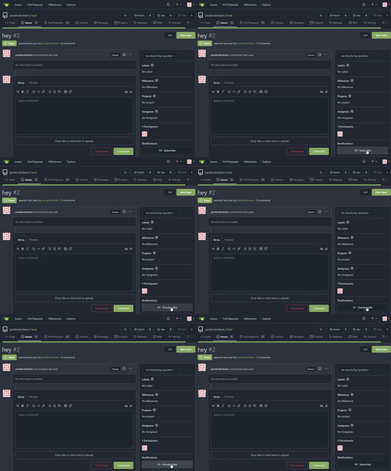

![subscribe_before](https://github.com/go-gitea/gitea/assets/20454870/cb2439a2-c3c0-425c-8d3c-5d646b1cdc28)

### After


![subscribe_after](https://github.com/go-gitea/gitea/assets/20454870/6fcd77d8-7b11-40b0-af4f-b152aaad787c)

## Don't do a full page load when clicking the follow button
- Use htmx to perform the button request
- `hx-post="{{.ContextUser.HomeLink}}?action=follow"` to send a POST
request to follow the user
- `hx-target="#profile-avatar-card"` to target the card div for
replacement
- `hx-indicator="#profile-avatar-card"` to place the loading indicator
on the card
- Change the backend response to return a `<div>` tag (the card) instead
of a redirect to the user page

### Before
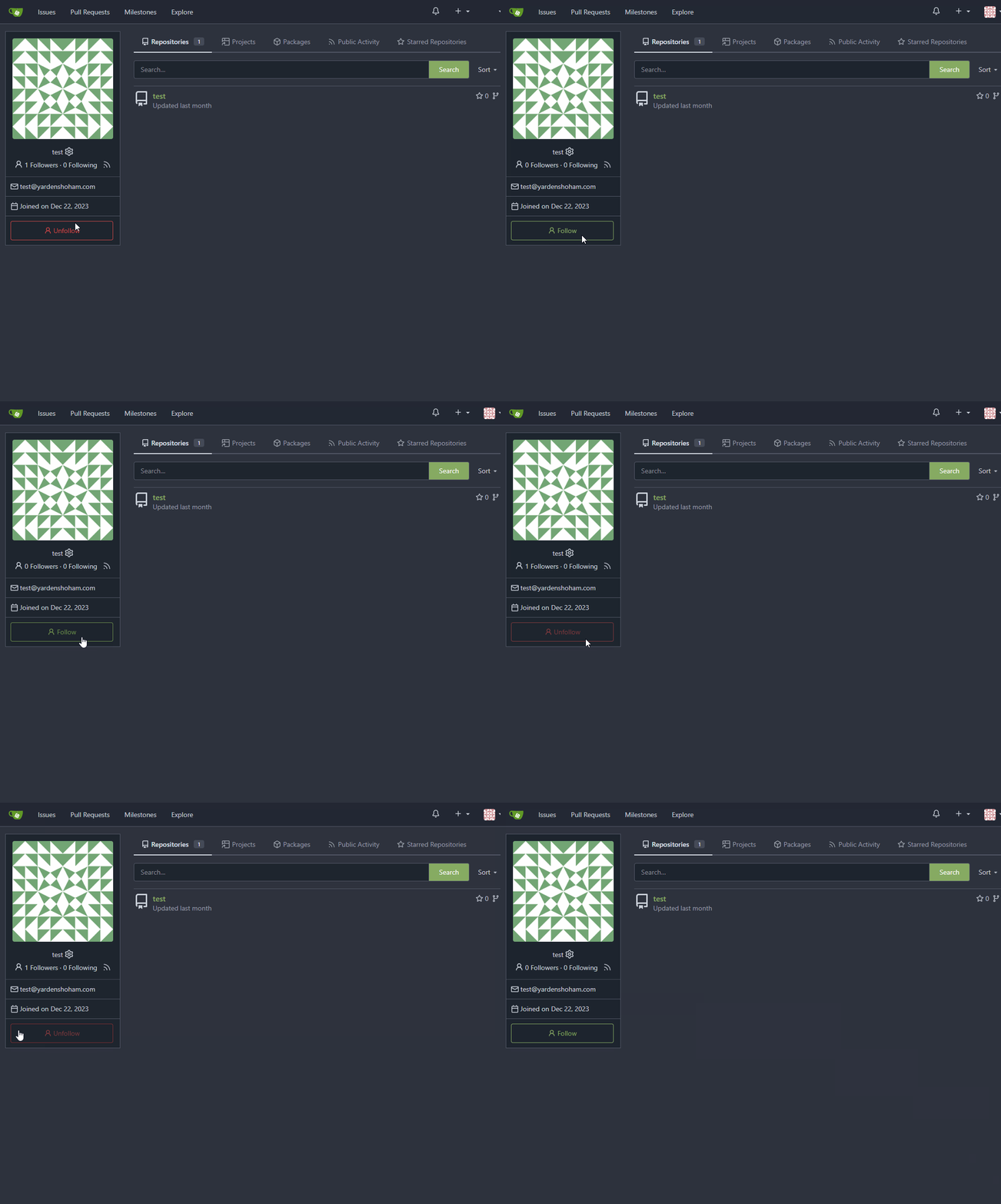

![follow_before](https://github.com/go-gitea/gitea/assets/20454870/a210b643-6e74-4ff9-8e61-d658c62edf1f)

### After


![follow_after](https://github.com/go-gitea/gitea/assets/20454870/5bb19ae9-0d59-4ae3-b538-4c83334e4722)

---------

Signed-off-by: Yarden Shoham <git@yardenshoham.com>
Co-authored-by: 6543 <m.huber@kithara.com>
Co-authored-by: Giteabot <teabot@gitea.io>
2024-01-30 15:45:54 +01:00
Matheus Sampaio Queiroga
37ede3197a
Fix google logo in security page (#28982)
Fix google logo in user security page: #28701

Before

![before user security
page](https://github.com/go-gitea/gitea/assets/50121801/6c058c28-8013-470a-b047-f47afecdca09)

after

![user security
page](https://github.com/go-gitea/gitea/assets/50121801/36053ee9-18c5-4ef0-a63a-8accc1d00adc)
2024-01-30 02:54:52 +02:00
silverwind
60e4a98ab0
Preserve BOM in web editor (#28935)
The `ToUTF8*` functions were stripping BOM, while BOM is actually valid
in UTF8, so the stripping must be optional depending on use case. This
does:

- Add a options struct to all `ToUTF8*` functions, that by default will
strip BOM to preserve existing behaviour
- Remove `ToUTF8` function, it was dead code
- Rename `ToUTF8WithErr` to `ToUTF8`
- Preserve BOM in Monaco Editor
- Remove a unnecessary newline in the textarea value. Browsers did
ignore it, it seems but it's better not to rely on this behaviour.

Fixes: https://github.com/go-gitea/gitea/issues/28743
Related: https://github.com/go-gitea/gitea/issues/6716 which seems to
have once introduced a mechanism that strips and re-adds the BOM, but
from what I can tell, this mechanism was removed at some point after
that PR.
2024-01-27 18:02:51 +00:00
Yarden Shoham
0e650dca30
Make loading animation less aggressive (#28955)
The current animation loops in a very fast manner, causing a slight
feeling of uncomfortableness. This change slows it a bit for a smoother
experience.

# Before


![before](https://github.com/go-gitea/gitea/assets/20454870/215a722d-feb4-4643-819d-c37a620c5e48)

# After


![after](https://github.com/go-gitea/gitea/assets/20454870/7acb1fab-9157-4f4d-8cc7-45fea0234b47)

Signed-off-by: Yarden Shoham <git@yardenshoham.com>
2024-01-27 20:27:37 +08:00
Jimmy Praet
ee3e83eec1
Don't reload timeline page when (un)resolving or replying conversation (#28654)
Fixes #15981
2024-01-24 03:26:28 +00:00
wxiaoguang
5d09023f13
Avoid duplicate JS error messages on UI (#28873)
Gitea treat JS errors seriously, so sometimes the JS errors caused by
3rdparty code (eg: browser extensions) would also be reported on Gitea
UI: TypeError: WeakMap key undefined (caused by extension DarkReader's
bug) #28861

To avoid fill the user's screen with a lot of error messages, this PR
merges the same error messages into one, like this:

```js
<div class="page-content">
  <div class="... js-global-error" data-global-error-msg-compact="testmsg1" data-global-error-msg-count="2">test msg 1 (2)</div>
  <div class="... js-global-error" data-global-error-msg-compact="testmsg2" data-global-error-msg-count="1">test msg 2</div>
</div>
```
2024-01-21 14:23:08 +00:00
6543
49d7663929
Revert adding htmx until we finaly decide to add it (#28879) 2024-01-21 21:42:35 +08:00
Yarden Shoham
14f6fcf448
Don't do a full page load when clicking the subscribe button (#28871)
- Refactor the form around the subscribe button into its own template
- Use htmx to perform the form submission
- `hx-boost="true"` to prevent the default form submission behavior of a
full page load
- `hx-sync="this:replace"` to replace the current request (in case the
button is clicked again before the response is returned)
  - `hx-target="this"` to replace the form tag with the new form tag
  - `hx-push-url="false"` to disable a change to the URL
  - `hx-swap="show:no-scroll"` to preserve the scroll position
- Change the backend response to return a `<form>` tag instead of a
redirect to the issue page
- Include `htmx.org` in javascript imports

This change introduces htmx with the hope we could use it to make Gitea
more reactive while keeping our "HTML rendered on the server" approach.

# Before


![before](https://github.com/go-gitea/gitea/assets/20454870/4ec3e81e-4dbf-4338-9968-b0655c276d4c)

# After


![after](https://github.com/go-gitea/gitea/assets/20454870/8c8841af-9bfe-40b2-b1cd-cd1f3c90ba4d)

---------

Signed-off-by: Yarden Shoham <git@yardenshoham.com>
2024-01-20 20:44:51 +01:00
JakobDev
885cc32b14
Show latest commit for file (#28067)
If you view a file, you can now see the latest commit that changed that file.

![grafik](https://github.com/go-gitea/gitea/assets/15185051/272c3120-6db7-4f88-86e1-60080c9aabe5)

---------

Co-authored-by: Denys Konovalov <kontakt@denyskon.de>
2024-01-15 17:42:15 +01:00
Jimmy Praet
5d3fdd1212
Add branch protection setting for ignoring stale approvals (#28498)
Fixes #27114.

* In Gitea 1.12 (#9532), a "dismiss stale approvals" branch protection
setting was introduced, for ignoring stale reviews when verifying the
approval count of a pull request.
* In Gitea 1.14 (#12674), the "dismiss review" feature was added.
* This caused confusion with users (#25858), as "dismiss" now means 2
different things.
* In Gitea 1.20 (#25882), the behavior of the "dismiss stale approvals"
branch protection was modified to actually dismiss the stale review.

For some users this new behavior of dismissing the stale reviews is not
desirable.

So this PR reintroduces the old behavior as a new "ignore stale
approvals" branch protection setting.

---------

Co-authored-by: delvh <dev.lh@web.de>
2024-01-15 07:20:01 +00:00
Earl Warren
3f342d6dff
Modernize merge button (#28140)
- Make use of the `form-fetch-action` for the merge button, which will
automatically prevent the action from happening multiple times and show
a nice loading indicator as user feedback while the merge request is
being processed by the server.
- Adjust the merge PR code to JSON response as this is required for the
`form-fetch-action` functionality.
- Resolves https://codeberg.org/forgejo/forgejo/issues/774
- Likely resolves the cause of
https://codeberg.org/forgejo/forgejo/issues/1688#issuecomment-1313044

(cherry picked from commit 4ec64c19507caefff7ddaad722b1b5792b97cc5a)

Co-authored-by: Gusted <postmaster@gusted.xyz>
2024-01-15 00:00:47 +02:00
wxiaoguang
ad0b637d46
Fix button size in "attached header right" (#28770)
Before:

<details>


![image](https://github.com/go-gitea/gitea/assets/2114189/c82f8615-04d4-408f-95bf-689c227a8814)


![image](https://github.com/go-gitea/gitea/assets/2114189/d01d05a7-09ca-48f3-a0e7-fec48119b426)

</details>

After:


![image](https://github.com/go-gitea/gitea/assets/2114189/e560398e-2fa4-4f46-9229-f6acc70e32ab)


![image](https://github.com/go-gitea/gitea/assets/2114189/bd18961d-0636-4584-b893-c465daaf40af)
2024-01-12 14:43:40 +00:00
wxiaoguang
34a0684397
Improve CSS helper naming (#28769)
* `gt-w-100` => `gt-w-full` to match tailwind
* clarify `gt-hidden` priority
2024-01-12 20:28:01 +08:00
Denys Konovalov
7d62615513
Revamp repo header (#27760)
Redesign repo header with following new aspects:
- responsive & better-looking repo title
- hide repo button text instead of icons in mobile view
- use same tab style as on explore and org page

<details>
<summary>Before:</summary>


![grafik](https://github.com/go-gitea/gitea/assets/47871822/57360b77-d43c-49ac-b798-2363c03da7ec)

![grafik](https://github.com/go-gitea/gitea/assets/47871822/d4117f79-a5f5-4f36-bf65-bbada3e7e73b)

![grafik](https://github.com/go-gitea/gitea/assets/47871822/e26f967f-e264-4337-9925-3d942e04fd6d)

![grafik](https://github.com/go-gitea/gitea/assets/47871822/b4683c8d-9c6a-4089-afa7-8dd219e43a46)


</details>

<details>
<summary>After:</summary>


![grafik](https://github.com/go-gitea/gitea/assets/47871822/8ddbc9f6-53c7-4e4e-bea9-704fd93524ca)

![grafik](https://github.com/go-gitea/gitea/assets/47871822/c0588aa9-788d-469c-98a0-81484fbd220c)

![grafik](https://github.com/go-gitea/gitea/assets/47871822/206e931e-404d-4d1b-92ce-908698addfcc)

![grafik](https://github.com/go-gitea/gitea/assets/47871822/a508f9c8-fadc-4a85-94ba-18796f77e07b)
2024-01-12 03:44:06 +00:00
wxiaoguang
9296c31ff7
Fix incorrect URL for "Reference in New Issue" (#28716)
Gitea prefers to use relative URLs in code (to make multiple domain work
for some users)

So it needs to use `toAbsoluteUrl` to generate a full URL when click
"Reference in New Issues"

And add some comments in the test code
2024-01-07 10:50:03 +00:00
Kyle D
e522e774ca
Add merge arrow direction and update styling (#28523)
Close https://github.com/go-gitea/gitea/issues/28522

~Adds some [negative
margin](https://tailwindcss.com/docs/margin#using-negative-values)
helper css classes using tailwind's [prefix
syntax](https://tailwindcss.com/docs/configuration#prefix)~

### Before

![image](https://github.com/go-gitea/gitea/assets/12700993/5bdabf91-facd-41c8-8e36-e1535beb9409)

### After

![image](https://github.com/go-gitea/gitea/assets/12700993/a6f11f6f-9e64-45b6-b9d7-dfea53fbc6d7)
2024-01-05 17:38:56 +00:00
Earl Warren
92711b001e
Apply min-height in wiki only on preview pane (#28687)
In the commit 5a56f9699c (3.) the min-height was applied to all wiki
elements. This resulted in huge blank spaces when viewing the wiki.

This fixes this by only applying the min-height to the preview when
editing.

Refs: https://codeberg.org/forgejo/forgejo/pulls/2080

(cherry picked from commit 8f0baefe5d)

Co-authored-by: Fl1tzi <git@fl1tzi.com>
2024-01-04 02:48:55 +00:00
Denys Konovalov
657b23d635
Fix wrapping of label list (#28684)
The label list needs to wrap the items to avoid unnecessary overflow / incorrect text wrapping.
2024-01-03 20:33:55 +08:00
Yarden Shoham
cdc33b29a0
Add global setting how timestamps should be rendered (#28657)
- Resolves https://github.com/go-gitea/gitea/issues/22493
- Related to https://github.com/go-gitea/gitea/issues/4520

Some admins prefer all timestamps to display the full date instead of
relative time. They can do that now by setting

```ini
[ui]
PREFERRED_TIMESTAMP_TENSE = absolute
```

This setting is set to `mixed` by default, allowing dates to render as
"5 hours ago". Here are some screenshots of the UI with this setting set
to `absolute`:

![image](https://github.com/go-gitea/gitea/assets/20454870/f496457f-6afa-44be-a1e7-249ee5fe0706)

![image](https://github.com/go-gitea/gitea/assets/20454870/c03b14f5-063d-4e13-9780-76ab002d76a9)

![image](https://github.com/go-gitea/gitea/assets/20454870/f4b34e28-1546-4374-9199-c43348844edd)

---------

Signed-off-by: Yarden Shoham <git@yardenshoham.com>
Co-authored-by: delvh <dev.lh@web.de>
2024-01-02 09:25:30 +08:00
silverwind
ce55a74374
Update JS dependencies (#28537)
- Update all JS dependencies excluding mcaptcha (breaking changes) and
stylelint (plugin not compatible with v16)
- Regenerate SVGs
- Update markdownlint rule names
- Fix one issue of heading in markdown discovered during lint
- Update for monaco options renames
- Fix stylelint rule length-zero-no-unit for custom properties
- Tested editor, swagger, sorting, vue, lint
2023-12-30 05:29:03 +00:00
wxiaoguang
8989d466ed
Fix flex container width (#28603)
Fix #28489
2023-12-24 22:39:02 +08:00
wxiaoguang
6632d1497c
Polyfill SubmitEvent for PaleMoon (#28441) 2023-12-15 07:26:36 +08:00
wxiaoguang
0a794b2bcd
Don't show unnecessary citation JS error on UI (#28433)
Fix #28226
2023-12-12 11:31:11 +00:00
Earl Warren
8b45a4d366
Use appSubUrl for OAuth2 callback URL tip (#28266)
- When crafting the OAuth2 callbackURL take into account `appSubUrl`,
which is quite safe given that its strictly formatted.
- No integration testing as this is all done in Javascript.
- Resolves https://codeberg.org/forgejo/forgejo/issues/1795

(cherry picked from commit 27cb6b7956)

Co-authored-by: Gusted <postmaster@gusted.xyz>
2023-11-29 01:37:12 +00:00
Nanguan Lin
37ed92d6fd
Revert "Fix EOL handling in web editor" (#28101)
Reverts go-gitea/gitea#27141
close #28097
2023-11-22 09:14:16 +00:00
wxiaoguang
247927a9b5
Use "is-loading" to avoid duplicate form submit for code comment (#28143)
When the form is going to be submitted, add the "is-loading" class to
show an indicator and avoid user UI events.

When the request finishes (success / error), remove the "is-loading"
class to make user can interact the UI.
2023-11-21 02:12:31 +00:00
KazzmanK
2de05f9432
Decrease issue font size in project template (#28054)
I propose to decrease font size. 18 is too big and looks ugly, on
windows. 14 is on par with other elements and save a bit of space.

![image](https://github.com/go-gitea/gitea/assets/13328513/bc41f65d-8f48-4fd9-8e3b-d7a73967b0aa)

![image](https://github.com/go-gitea/gitea/assets/13328513/70e78919-9b9b-4f57-a491-d746ea59c048)

Co-authored-by: Nikolay Kobzarev <n.kobzarev@aeronavigator.ru>
2023-11-19 02:02:26 +00:00
sebastian-sauer
e31c6cfe6e
Fix Show/hide filetree button on small displays (#27881)
the gt-df's display:flex !important did override the display:none on small displays

---------

Co-authored-by: wxiaoguang <wxiaoguang@gmail.com>
2023-11-17 18:35:51 +00:00
sebastian-sauer
49dddd87b1
Improve PR diff view on mobile (#27883)
1. Show diff stats only on large screens

these are already shown in tabs, so no need for this duplicate
information on small screens


![image](https://github.com/go-gitea/gitea/assets/1135157/1287839d-7490-42eb-a17e-d526dc0bfd9e)

![image](https://github.com/go-gitea/gitea/assets/1135157/e9dcd89d-ed4d-4945-a7aa-4e6fc6d9c3a2)


2. Hide viewed files information on small screens

Github does the same and this gives us more free space on small screens


![image](https://github.com/go-gitea/gitea/assets/1135157/e90b042f-fffb-4f79-a5ae-cd480c9d8334)

![image](https://github.com/go-gitea/gitea/assets/1135157/d2480ffe-58f2-4694-8ae1-a2ab0aae14d4)


3. Review bar now doesn't wrap so we don't need the 77px even on very
small screens

(the sticky headers are still working)


![image](https://github.com/go-gitea/gitea/assets/1135157/42b19b2b-73ef-4b88-8680-c555879b363b)
2023-11-16 11:58:53 +08:00
wxiaoguang
f860fe31d9
Move some JS code from fomantic.js to standalone files (#27994)
To improve maintainability, this PR: 

1. Rename `web_src/js/modules/aria` to `web_src/js/modules/fomantic`
(the code there are all for aria of fomantic)
2. Move api/transition related code to
`web_src/js/modules/fomantic/api.js` and
`web_src/js/modules/fomantic/transition.js`

No logic is changed.
2023-11-12 07:15:00 +00:00
Nanguan Lin
6c9e196e54
Show error toast when file size exceeds the limits (#27985)
As title.
Before that, there was no alert at all.
After:

![error_toast](https://github.com/go-gitea/gitea/assets/70063547/c54ffeed-76f8-4c3a-b5dc-b9b3e0f8fc76)
2023-11-10 19:43:18 +08:00
yp05327
4a0103fa29
Add word-break to repo description in home page (#27924)
In #25315, @denyskon fixed UI on mobile view.
But for the repo description, on desktop view there's no word-break. 
So maybe we can just add `gt-word-break` to fix it on both mobile view
and desktop view.

Before:
desktop view:

![image](https://github.com/go-gitea/gitea/assets/18380374/a7659f5b-fbe9-400a-8cc2-cca44778556e)
mobile view:

![image](https://github.com/go-gitea/gitea/assets/18380374/611f1b81-58ac-4213-b165-5c73e24ca79e)

After:
desktop view:

![image](https://github.com/go-gitea/gitea/assets/18380374/f21bf3a7-f6aa-457d-9bfa-5c57659c68b1)
mobile view(almost same?)

![image](https://github.com/go-gitea/gitea/assets/18380374/ad2d1a4d-1172-402c-b5fc-5e910657847d)

---------

Co-authored-by: silverwind <me@silverwind.io>
2023-11-07 23:52:08 +00:00
wxiaoguang
10a6ebb3fd
Fix the overflow style for "Hide all checks" (#27932)
Fix #27928

---------

Co-authored-by: silverwind <me@silverwind.io>
2023-11-07 18:53:35 +00:00
silverwind
abd79ddebf
Update JS dependencies (#27922)
- Update all JS dependencies minus @mcaptcha/vanilla-glue (unsolved
error, see https://github.com/mCaptcha/glue/issues/65)
- Migrate deprecated eslint rules to `@stylistic/eslint-plugin-js`
- Enable and autofix `@stylistic/js/no-multiple-empty-lines`
- Regenerate poetry.lock with latest poetry
- Tested Mermaid, Swagger, Citation, Vue
2023-11-06 21:14:32 +00:00
yp05327
7a2ff6c162
Fix edit topic UI (#27925)
Before:
desktop view:

![image](https://github.com/go-gitea/gitea/assets/18380374/c04d8730-5dac-4318-9643-72801da0ca16)
mobile view:

![image](https://github.com/go-gitea/gitea/assets/18380374/187220d3-1fcc-4db8-9cf8-ee88fe92d989)
after click `Save` btn:

![image](https://github.com/go-gitea/gitea/assets/18380374/c3242470-7e6f-4ddc-a2ac-d896bbd39529)

![image](https://github.com/go-gitea/gitea/assets/18380374/82e03ba5-a6d2-4437-b074-387e7ad5b6ba)
refresh the page, you will see that `gt-m-0` is missing after save
topic:

![image](https://github.com/go-gitea/gitea/assets/18380374/26914820-9363-483c-af70-78b76de47523)


After:
desktop view:

![image](https://github.com/go-gitea/gitea/assets/18380374/12d878e1-351e-4983-b3d9-5216e9f30a19)
mobile view:

![image](https://github.com/go-gitea/gitea/assets/18380374/4adf9b0f-977b-4bbc-a42f-b9bfb2d648dd)
after click `Save` btn:

![image](https://github.com/go-gitea/gitea/assets/18380374/064c911e-d074-4432-8a55-8ff8ddb93989)
2023-11-06 09:23:50 +00:00
delvh
1f501dae9e
Fix JS NPE when viewing specific range of PR commits (#27912)
This should be the easiest fix.
While other solutions might be possible that exterminate the root cause,
they will not be as trivial.
2023-11-06 02:05:24 +00:00
yp05327
dcb648ee71
Add Hide/Show all checks button to commit status check (#26284)
Step one for a GitHub like commit status check ui:

![image](https://github.com/go-gitea/gitea/assets/18380374/22953b88-1f91-4d19-bc57-ad92d33fa11f)

![image](https://github.com/go-gitea/gitea/assets/18380374/78572a49-c9b0-472b-86a8-8293197e807b)

![image](https://github.com/go-gitea/gitea/assets/18380374/bc5c8d1c-2ab5-4b03-b8c6-20c34b86d856)

Step two:

![image](https://github.com/go-gitea/gitea/assets/18380374/938b359e-8823-4192-b82d-55fa40b986fd)

![image](https://github.com/go-gitea/gitea/assets/18380374/2de5bb8f-40f5-462a-8d6d-bac13a32bc2a)

The design now will list all commit status checks which takes too much
space.
This is a pre-improve for #26247

---------

Co-authored-by: delvh <dev.lh@web.de>
Co-authored-by: silverwind <me@silverwind.io>
Co-authored-by: wxiaoguang <wxiaoguang@gmail.com>
2023-11-02 14:49:02 +00:00
silverwind
dc52f26d46
Reduce margin/padding on flex-list items and divider (#27872)
Small CSS tweak, reduces margin/padding from 14px to 10px, which I think
looks better
2023-11-02 12:30:38 +08:00
KN4CK3R
3c78cb832d
Change katex limits (#27823)
Fixes #27812

Use higher defaults again but limit the input size.

![grafik](https://github.com/go-gitea/gitea/assets/1666336/23cdf572-de30-4799-b9cf-ef386b1623b9)
2023-10-29 01:52:02 +00:00
silverwind
05aa91e6da
Add dedicated class for empty placeholders (#27788)
Fixes: https://github.com/go-gitea/gitea/issues/27784

<img width="1033" alt="Screenshot 2023-10-25 at 19 07 15"
src="https://github.com/go-gitea/gitea/assets/115237/1a363851-1a86-48cb-99ec-0a573371bb6e">
<img width="1051" alt="Screenshot 2023-10-25 at 19 07 41"
src="https://github.com/go-gitea/gitea/assets/115237/add4b606-2264-430a-af35-249ef005817f">

Co-authored-by: KN4CK3R <admin@oldschoolhack.me>
2023-10-25 23:42:14 +02:00
Brecht Van Lommel
7a286e4753
Improve pull request command line instructions (#27778)
* Show checkout instructions also when there is no permission to push,
for anyone who wants to locally test the changes.
* First checkout the branch exactly as is, without immediately having to
solve merge conflicts. Leave this to the merge step, since it's often
convenient to test a change without worrying about this.
* Use `git fetch -u`, so an existing local branch is updated when
re-testing the same pull request. But not the more risky `git fetch -f`
in to handle force pushes, as we don't want to accidentally overwrite
important local changes.
* Show different merge command depending on the chosen merge style,
interactively updated.
2023-10-25 15:01:31 +00:00
yp05327
f39256f035
Add word-break to organization name and description (#26624)
Fix #24318

Before:

![image](https://github.com/go-gitea/gitea/assets/18380374/38282e5e-0b4d-4568-a853-59352798e826)

![image](https://github.com/go-gitea/gitea/assets/18380374/79d89ee6-61f6-45a7-af0b-d1c23fead25a)

![image](https://github.com/go-gitea/gitea/assets/18380374/39b45fae-52e2-4697-b83a-7cd10f76ac43)

After:

![image](https://github.com/go-gitea/gitea/assets/18380374/09e8cfcf-0150-494e-9f63-0868f529da65)

![image](https://github.com/go-gitea/gitea/assets/18380374/d2c348d3-fe03-466a-a5f4-878b7a93a318)

![image](https://github.com/go-gitea/gitea/assets/18380374/7f75b807-300c-42d5-b2c3-bae9e45e3c08)

![image](https://github.com/go-gitea/gitea/assets/18380374/06eca901-f5cf-4100-bb65-92457ad106e3)
2023-10-25 10:40:39 +00:00
Nanguan Lin
3602a1987d
Add border to file tree 'sub-items' and add padding to 'item-file' (#27593)
## Add border to file tree 'sub-items'
close #24766 
view in `gitea-light` 
<img width="275" alt="image"
src="https://github.com/go-gitea/gitea/assets/70063547/f1bf8736-2db3-454f-86f5-d050a2fae3eb">
view in `gitea-dark`
<img width="296" alt="image"
src="https://github.com/go-gitea/gitea/assets/70063547/053e2e6e-28f7-41d2-a139-1dae4df45929">
## Change the 'item-file' padding 
Before that the 'item-file' only have padding when they in
'item-directory', which is too compact when 'item-file' after
'item-directory'
<details>

![)RW`SDJ_UQL@$}0
PL(3DS7](https://github.com/go-gitea/gitea/assets/70063547/5fa523a4-44c3-4cb9-a882-a3ea6d944673)

---------

Co-authored-by: silverwind <me@silverwind.io>
2023-10-25 18:00:53 +08:00
silverwind
fba4ee7efc
Add gap between diff boxes (#27776)
Before (almost no gap between files):
<img width="1240" alt="Screenshot 2023-10-24 at 19 43 32"
src="https://github.com/go-gitea/gitea/assets/115237/30cdbdbc-d102-479c-89ce-3f68837ae0cd">

After (with 8px gap):
<img width="1241" alt="Screenshot 2023-10-24 at 19 43 22"
src="https://github.com/go-gitea/gitea/assets/115237/72b26a30-8730-4a36-8de9-be143b684b98">
2023-10-25 00:47:17 +02:00
Nanguan Lin
51d1dc22ff
Fix duplicate project board when hitting enter key (#27746)
When hitting the `enter` key to create a new project column, the request
is sent twice because the `submit` event and `key up` event are both
triggered.
Probably a better solution is to rewrite these parts of the code to
avoid using native jQuery but reuse the `form-fetch-action` class. But
it's beyond my ability.
2023-10-23 12:40:33 +00:00