mirror of
https://codeberg.org/forgejo/forgejo.git
synced 2024-12-25 13:19:37 -05:00
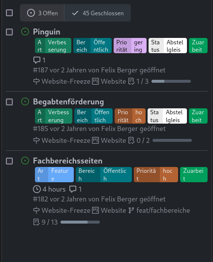
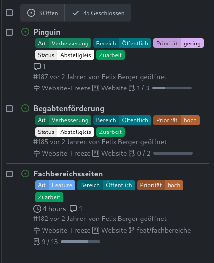
Backport #28684 by @denyskon
Before:

After:

Co-authored-by: Denys Konovalov <kontakt@denyskon.de>
(cherry picked from commit e67c819cf4)
118 lines
2.8 KiB
CSS
118 lines
2.8 KiB
CSS
.issue-list-toolbar {
|
|
display: flex;
|
|
flex-wrap: wrap-reverse;
|
|
justify-content: space-between;
|
|
align-items: flex-start;
|
|
gap: 1rem;
|
|
margin-top: 1rem;
|
|
}
|
|
|
|
.issue-list-toolbar-left {
|
|
display: flex;
|
|
}
|
|
|
|
.issue-list-toolbar-right .filter.menu {
|
|
flex-direction: row;
|
|
flex-wrap: wrap;
|
|
}
|
|
|
|
@media (max-width: 767.98px) {
|
|
.issue-list-navbar {
|
|
order: 0;
|
|
}
|
|
.issue-list-new {
|
|
order: 1;
|
|
margin-left: auto !important;
|
|
}
|
|
.issue-list-search {
|
|
order: 2 !important;
|
|
}
|
|
/* Don't use flex wrap on mobile as it takes too much vertical space.
|
|
* Only set overflow properties on mobile screens, because while the
|
|
* CSS trick to pop out from overflowing works on desktop screen, it
|
|
* has a massive flaw that it cannot inherited any max width from it's 'real'
|
|
* parent and therefor ends up taking more vertical space than is desired.
|
|
**/
|
|
.issue-list-toolbar-right .filter.menu {
|
|
flex-wrap: nowrap;
|
|
overflow-x: auto;
|
|
overflow-y: hidden;
|
|
}
|
|
|
|
/* The following few CSS was created with care and built with the information
|
|
* from CSS-Tricks: https://css-tricks.com/popping-hidden-overflow/
|
|
*/
|
|
|
|
/* It's important that every element up to .issue-list-toolbar-right doesn't
|
|
* have a position set, such that element that wants to pop out will use
|
|
* .issue-list-toolbar-right as 'clip parent' and thereby avoids the
|
|
* overflow-y: hidden.
|
|
*/
|
|
.issue-list-toolbar-right .filter.menu > .dropdown.item {
|
|
position: initial;
|
|
}
|
|
/* It's important that this element and not an child has `position` set.
|
|
* Set width so that overflow-x knows where to stop overflowing.
|
|
*/
|
|
.issue-list-toolbar-right {
|
|
position: relative;
|
|
width: 100%;
|
|
}
|
|
}
|
|
|
|
#issue-list .flex-item-title .labels-list {
|
|
display: flex;
|
|
flex-wrap: wrap;
|
|
gap: 0.25em;
|
|
}
|
|
|
|
#issue-list .flex-item-title .labels-list a {
|
|
display: flex;
|
|
text-decoration: none;
|
|
}
|
|
|
|
#issue-list .flex-item-title .labels-list .label {
|
|
padding: 0 6px;
|
|
margin: 0;
|
|
min-height: 20px;
|
|
}
|
|
|
|
#issue-list .flex-item-body .branches {
|
|
display: inline-flex;
|
|
}
|
|
|
|
#issue-list .flex-item-body .branches .branch {
|
|
background-color: var(--color-secondary-alpha-40);
|
|
border-radius: var(--border-radius);
|
|
padding: 0 4px;
|
|
}
|
|
|
|
#issue-list .flex-item-body .branches .truncated-name {
|
|
white-space: nowrap;
|
|
overflow: hidden;
|
|
text-overflow: ellipsis;
|
|
max-width: 10em;
|
|
}
|
|
|
|
#issue-list .flex-item-body .checklist progress {
|
|
margin-left: 2px;
|
|
width: 80px;
|
|
height: 6px;
|
|
display: inline-block;
|
|
}
|
|
|
|
#issue-list .flex-item-body .checklist progress::-webkit-progress-value {
|
|
background-color: var(--color-secondary-dark-4);
|
|
}
|
|
|
|
#issue-list .flex-item-body .checklist progress::-moz-progress-bar {
|
|
background-color: var(--color-secondary-dark-4);
|
|
}
|
|
|
|
.archived-label-filter {
|
|
margin-left: 10px;
|
|
font-size: 12px;
|
|
display: flex !important;
|
|
margin-bottom: 8px;
|
|
min-width: fit-content;
|
|
}
|