mirror of
https://codeberg.org/forgejo/forgejo.git
synced 2024-11-23 08:47:42 -05:00
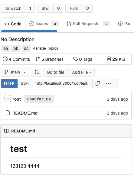
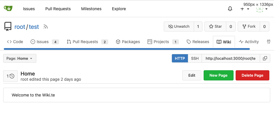
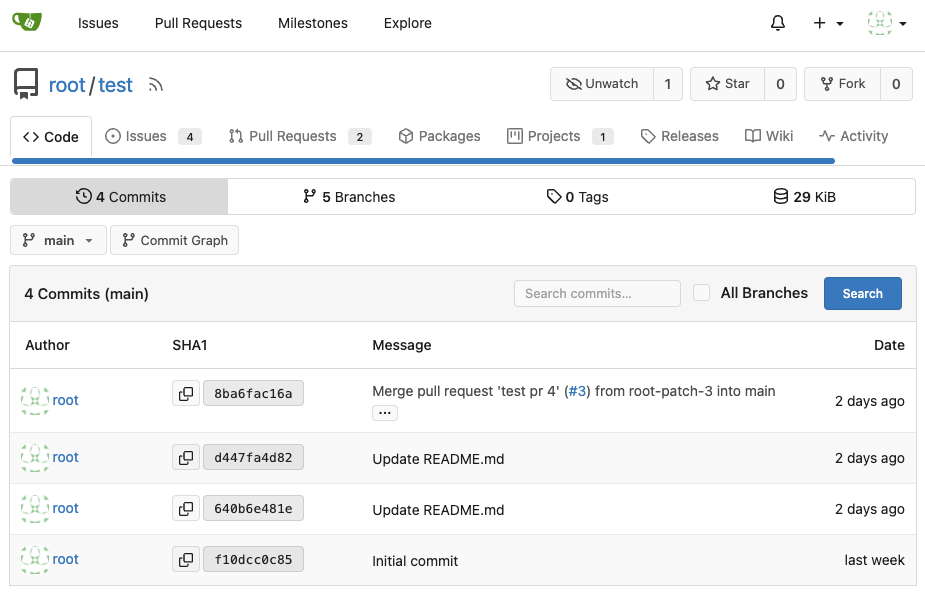
Backport #25277 by @wxiaoguang Fixes: https://github.com/go-gitea/gitea/issues/25282 Fix the problems: 1. The `repo-button-row` had various patches before, this PR makes it consistent 2. The "Add File" has wrong CSS class "icon", remove it 3. The "Add File" padding was overridden by "!important", fix it by `.repo-button-row .button.dropdown` with comment 4. The selector `.ui.segments ~ .ui.top.attached.header` is incorrect, it should use `+` The `repo-button-row` is only used on 3 pages:     Co-authored-by: wxiaoguang <wxiaoguang@gmail.com>
20 lines
640 B
Handlebars
20 lines
640 B
Handlebars
{{template "base/head" .}}
|
|
<div role="main" aria-label="{{.Title}}" class="page-content repository commits">
|
|
{{template "repo/header" .}}
|
|
<div class="ui container">
|
|
{{template "repo/sub_menu" .}}
|
|
<div class="repo-button-row">
|
|
<div class="gt-df gt-ac">
|
|
{{template "repo/branch_dropdown" dict "root" . "ContainerClasses" "gt-mr-2"}}
|
|
<a href="{{.RepoLink}}/graph" class="ui basic small compact button">
|
|
<span class="text">
|
|
{{svg "octicon-git-branch"}}
|
|
</span>
|
|
{{.locale.Tr "repo.commit_graph"}}
|
|
</a>
|
|
</div>
|
|
</div>
|
|
{{template "repo/commits_table" .}}
|
|
</div>
|
|
</div>
|
|
{{template "base/footer" .}}
|